FREE Standard Shipping on Orders $69+ with code:
FREESHIPPING

Cheers
Give a Cheer

 Give a Cheer
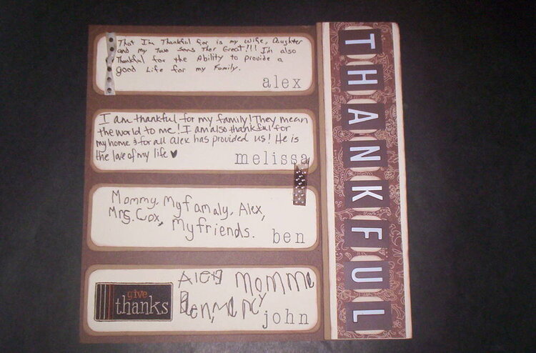
MOnocromatic Layout - My family did this one together. We each wrote what we are thankful for.
No products have been added to this project.

Thanks for spreading positivity!


July 04, 2007
June 28, 2007
June 27, 2007
June 26, 2007
June 26, 2007
June 26, 2007
June 26, 2007
June 26, 2007
June 26, 2007
June 26, 2007
November 12, 2006
November 11, 2006
November 11, 2006
November 11, 2006
November 10, 2006
November 10, 2006
November 10, 2006
November 10, 2006