Thank YOU! It's Customer Appreciation Week!
EXTRA 11% OFF Orders $100+ With Code: THANKYOU
EXTRA 11% OFF Orders $100+ With Code: THANKYOU

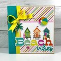
 Give a Cheer
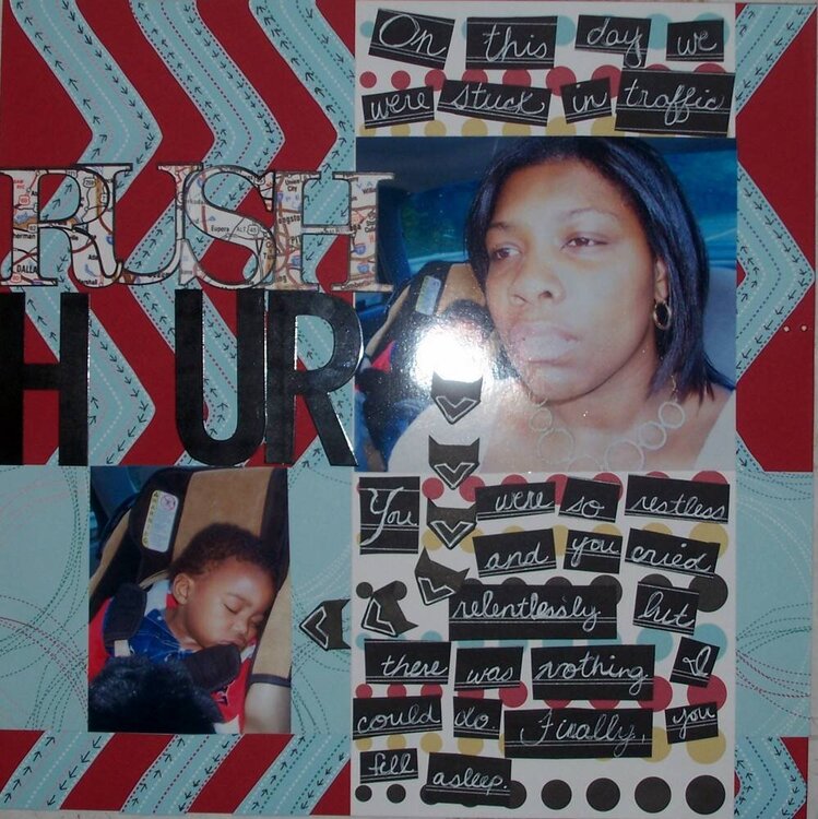
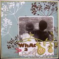
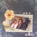
This is a pic of me and my son stuck in traffic. Sorry about the flash. There's no "O" because I just don't know what embellie to use. I was trying to make a stop sign but my octagon was horrible! I thought about a clock. . .
I used:
Bazzill cs
American Crafts pp and metal letters
DCWV black paper
Heidi Swapp photo corners
Reminisce map letters
Gelly Roll Sakura white pen
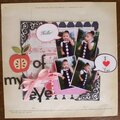
No products have been added to this project.


Thanks for spreading positivity!


November 16, 2006
November 16, 2006
November 16, 2006
November 16, 2006
November 16, 2006
November 15, 2006
November 15, 2006
November 15, 2006
November 15, 2006