Thank YOU! It's Customer Appreciation Week!
EXTRA 11% OFF Orders $100+ With Code: THANKYOU
EXTRA 11% OFF Orders $100+ With Code: THANKYOU

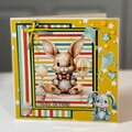
 Give a Cheer
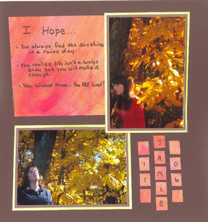
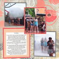
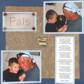
My daughter & I were taking turns taking pictures so we could become better photographers.
IRL, the LO has very straight lines & is centered. Either my scanner is not scanning as clearly as it used to or my photo program is not "sewing" the 2 scans of my 12 x 12's together like it should.
No products have been added to this project.
Thanks for spreading positivity!


November 24, 2006
November 22, 2006
November 22, 2006
November 22, 2006
November 22, 2006
November 22, 2006
November 21, 2006
November 21, 2006
November 21, 2006
November 21, 2006
November 21, 2006