FREE Standard Shipping on Orders $69+ with code:
FREESHIPPING

Cheers
Be the first to cheer this project!
Give a Cheer
Be the first to cheer this project!
 Give a Cheer
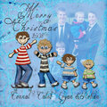
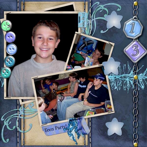
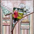
Heres Connal again, my teenager boy in a matching and contrasting page to the one I finished earlier.
Using that technique I logged down earlier I have flipped the canvas to make a second matching page and swapped the background papers to give the pages a contrasting effect. Using the chipped paint tin buttons I then linked and dragged them over to continue the theme of the page. They don't exactly match up but it looks more realistic with them slightly uneven. I think that having details too perfected in symmetry can be a mistake when trying to create the realism paper scrapbooking effect. I've learn't this over time. I really liked the main photo of Connal pre- braces and wanted to use it but the background was a mess,so I have blended in a black to cover up the distraction, placing more focus on his face.
thank-you for looking
No products have been added to this project.

Thanks for spreading positivity!