
Happy National Scrapbook Day!
Extra 10% OFF Select Scrapbooking Brands with Code: NSD24
Extra 10% OFF Select Scrapbooking Brands with Code: NSD24

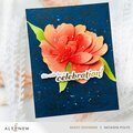
 Give a Cheer
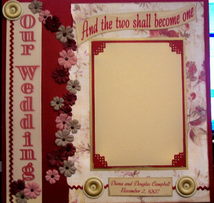
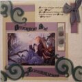
Front page of a wedding album I am doing for my cousins.
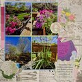
No products have been added to this project.
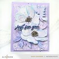
Thanks for spreading positivity!


June 30, 2008
June 24, 2007
April 28, 2007
January 05, 2007
December 26, 2006
December 26, 2006
December 26, 2006
December 23, 2006
December 23, 2006
December 23, 2006
December 23, 2006
December 23, 2006
December 23, 2006
December 23, 2006
December 23, 2006
December 23, 2006
December 23, 2006
December 23, 2006