FREE Standard Shipping on Orders $69+ with code:
FREESHIPPING

Cheers
Give a Cheer

 Give a Cheer
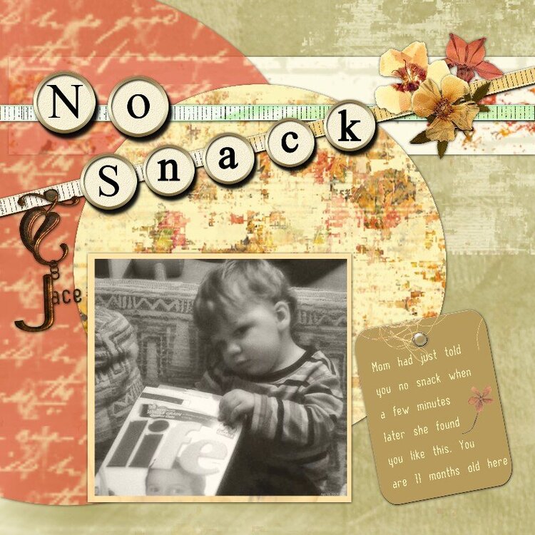
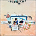
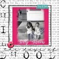
I used some papers from my newest kit I'm working on called, " Grunge Delight"
Supplies: Grunge Delight by Emma Moore for ScrapStreet
Cream Typewriter Alpha (Lower) & (Upper) Created by Meryl Bartho © 2006 Meryl Bartho
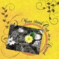
Pressed Flowers from kit Pressed Due by Deanna Tafoya designer for scrapinthebox
Font: BN Pinky
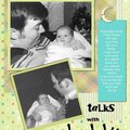
Journaling: Mom had just told you no snack when she found you a few minutes later like this. You are 11 months old here.
No products have been added to this project.


Thanks for spreading positivity!


September 11, 2007
January 21, 2007
January 16, 2007
January 15, 2007
January 15, 2007
January 15, 2007
January 15, 2007