
Cheers
Give a Cheer

 Give a Cheer
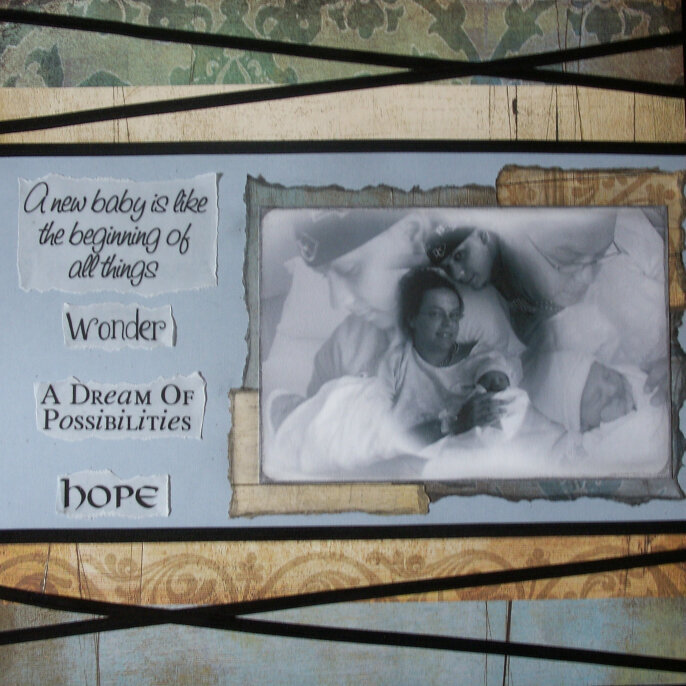
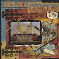
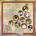
This is my entry for Weekly Challenge #2. This is the first page I've done so far for a gift album I have been thinking about doing for some friends.
No products have been added to this project.

Thanks for spreading positivity!


June 22, 2007
January 18, 2007
January 15, 2007
January 14, 2007
January 14, 2007
January 14, 2007
January 14, 2007
January 13, 2007
January 13, 2007