


FREE Standard Shipping on Orders $69+ with code:
FREESHIPPING
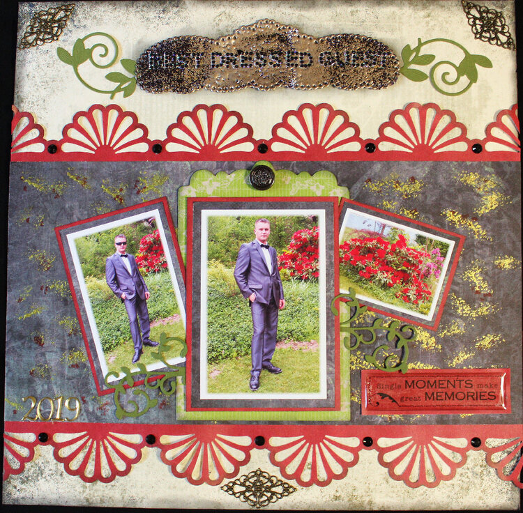


 Give a Cheer
So the story behind the pictures and title...this is my youngest, Dan, who was heading to a good friend's wedding last year. When he got to the wedding, which was up north by Lake Chelan, he found out that it wasn't a real formal wedding, although the bride and groom were dressed for the occasion. Anyway, he had several people come up and tell him how nice he looked and that he was the best dressed guest there!! He got a kick out of that!
I really struggled with a design for this layout, as well as choosing papers. The green chipboard piece under the main picture was in my scraps bag and actually Prima packaging that came with some flowers.
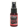
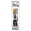
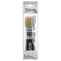
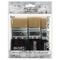
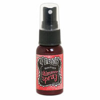
On the black paper I just used my Tim Holtz distress collage brush, tapped it in the Prima Alchemy Fairy Wings paint and tapped it all around. The red splotches are Dylusions Postbox Red ink spray. I just unscrewed the sprayer and tapped the excess onto my craft sheet and then took my skinny paintbrush and dabbed it here and there.
I wasn't sure if I should use the picture of our rhodie bushes but decided to just go with it since you can see part of them in the pictures.
Metal pieces are from Amazon or Aliexpress.
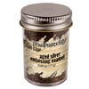
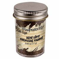
Thank you Laura for the diecut that has the title on it. It started out white and I used Stampendous Aged Silver Embossing Enamel.
2019 stickers are Spare Parts from HL. The epoxy sticker is Heidi Grace, most likely from Joann's. I've had it for ages. Button from my stash.
Background paper is old Bo Bunny Block Party Picnic. Red paper is Paper Studio from HL. Bling letters are Triveni from our closed Craft Warehouse.
Thank you so much for visiting my gallery!!


Thanks for spreading positivity!


June 25, 2020
June 25, 2020
June 25, 2020
June 25, 2020
June 24, 2020
June 24, 2020
June 22, 2020
June 22, 2020
June 22, 2020
May 31, 2020
May 31, 2020
May 31, 2020
May 31, 2020
May 31, 2020
May 31, 2020
May 31, 2020
May 31, 2020
May 31, 2020
May 30, 2020
May 30, 2020
May 30, 2020
May 30, 2020
May 30, 2020
May 30, 2020
May 30, 2020
May 30, 2020
May 30, 2020
May 30, 2020
May 29, 2020
May 29, 2020
May 29, 2020
May 29, 2020
May 29, 2020
May 29, 2020
May 29, 2020
May 29, 2020
May 29, 2020
May 29, 2020
May 29, 2020
May 29, 2020
May 29, 2020
May 29, 2020
May 29, 2020
May 29, 2020
May 29, 2020
May 29, 2020
May 29, 2020
May 29, 2020
May 29, 2020
May 29, 2020
May 29, 2020
May 29, 2020
May 29, 2020
May 29, 2020
May 29, 2020
May 29, 2020
May 29, 2020
May 29, 2020
May 29, 2020
May 29, 2020
May 29, 2020
May 29, 2020
May 29, 2020
May 29, 2020
May 29, 2020
May 29, 2020
May 29, 2020
May 29, 2020
May 29, 2020
May 29, 2020
May 29, 2020
May 29, 2020
May 29, 2020
May 29, 2020
May 29, 2020
May 29, 2020
May 29, 2020
May 29, 2020
May 29, 2020
May 29, 2020
May 29, 2020