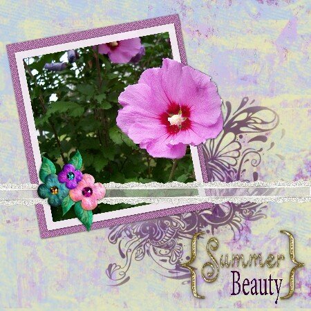
That flourish behind the photo is absolutely beautiful. I also like the contrast of the dark leaves against the vibrant pink flower. It makes me long for summer.
I love this! The one thing I would suggest to try and fix is the edging on the larger flower because it does look a little rough to me. Perhaps feathering it or doing an edge blur would help that--it's not a bad edging but it pulled my eye away for a minute from your layout. I really love the feel of this--the angle of the photo, the font choice, especially the rub-on at the corner of the photo frame. I'm personally not minding the back paper (it's reminding me of that high-glaze vintage glasswear, vases & such, that you see in some stores).
hmm....Amamore. I like everything but the paper...it seems a bit light to me...it fights for my attention with the lovely flower and your pretty embelishments.
Does this project or one of it's images contain pornography, profanity, or other illegal or offensive material? If so, please report it and our moderators will come by and clean it up in a flash.


 Give a Cheer


February 27, 2007
February 27, 2007
February 27, 2007
February 26, 2007
February 26, 2007
February 25, 2007
February 25, 2007