p.s. the smaller version is more accurate to what the original looked like in Photoshop...I'm not sure why the difference in the grainy dots & font shows up (weird!)
Yes, the drop shadow is actually my own creation--duplicated layer of the same text--I lifted the lighter top colour from my face. I did want it to show through and also be slightly offset, but not by much.
I've been trying to recover some old photo's lately too. I found a new plugin that can clean up noise in old images (and new) that I abolutely can't live without called NeatImage. Question: on the big version, your "Valentine Rose" and "blossom" words are semi-transparent so that the drop-shadow shows through(or you created a dropshadow separately and put it on top), was that intentional? The resized version makes it look like an embossing effect.
I've been going back through old pics also and know what you mean about having to twick them alot to be usable. Love what you did here and look at that little cutie.
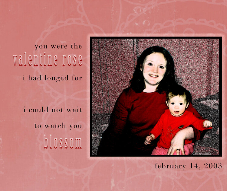
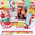
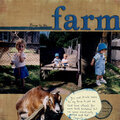
I've been going back to older photos of my daughter. This was definitely a layout that evolved as I created it. The photo was not great (the background is lockers and a dangling cord) so I had to filter it to make it useable. I've been inspired a lot by Amanda Taylor's layouts so the sizing and some of the "feel" was my own spin on some of what she has done!
Does this project or one of it's images contain pornography, profanity, or other illegal or offensive material? If so, please report it and our moderators will come by and clean it up in a flash.
March 04, 2007
March 03, 2007
March 02, 2007
March 02, 2007