


Livestream Party!
Join us today at 9:00am PT / 12:00pm ET | Details Here.
Join us today at 9:00am PT / 12:00pm ET | Details Here.

 Give a Cheer
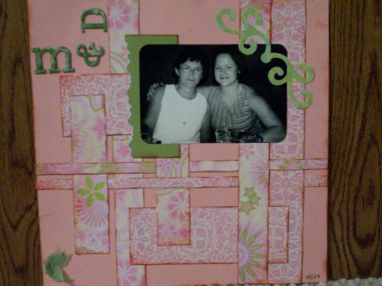
A picture of my mom & I on her birthday.


Thanks for spreading positivity!


June 14, 2007
May 06, 2007
April 10, 2007
April 10, 2007
April 10, 2007
March 31, 2007
March 30, 2007
March 26, 2007
March 18, 2007
March 18, 2007
March 17, 2007
March 17, 2007
March 16, 2007
March 15, 2007
March 15, 2007
March 15, 2007
March 15, 2007
March 15, 2007
March 15, 2007