I love this layout, the colors and patterns look so good together, and the distressing is great too! I'm trying to think of some constructive criticism, and the only thing I can really come up with is that the flower might look a little better if it was moved over to the right a bit. Good page!
I think this is such a cute idea for a LO. I wish I would've thought to do something like that with my girls' stuff from when they were little. I'm a huge Basic Grey fan so of course I absolutely love the paper and the colors. Also, the flower up top is a perfect touch. Great job!!
the ribbon slid when I took the photo....it really does go across....Ineed to trim the top of the hidden pocket so it looks even. I was thinking the same thing with the brad....I wanted it to be silver as the smaller ones but I need to put a larger one there..maybe onthe top left side of the pic but not at the corner.
thanks for the great ideas!
How do you feel about this layout?????
im not a big fan of this line of basic grey but you work it out well! I love how it matches the slippers! here is my advice if this page were in my hands:
-I like the pull out journaling (i find that i do that alot because it just doesnt look right on the page) but there are three brads for each little square (on the right) and then there's half of a square. it just looks a little awkward and off balance. i would take that off even if it means being uneven with the journal block because this is your intial view of the page. the journal block is hidden so uneveness wont be that big of a deal in my honest opinion.
i also love how the title is bound by ribbon on each side, but why is the ribbon kindof crooked on the right? i would stick a glue dot in a couple of places so it isnt hangin down by itself.
I also love the little flower! they are wonderful accents arent they!?!?! it looks a little odd there by itself so putting another with it would be a great idea, but how about you put them right next to each other and in the top right corner (not ALL the way in the corner though make it a little down like an inch away from each side) that would take away from the middle areas of the page which looks really busy and bring some balance to the page! another tip: whenever i put a flower on a page, i usually put something in the middle that fits the circle where the middle used to be, so that the middle item touches the petals. maybe use i lighter shade of yellow or pink or even a white button. these look fun!!
I am not being forceful with these sggestions, just helpful, and just what i would do. i hope i can help you with whatever you are looking for!!
You did an beautiful job on this page and kudos for working that BG well!
Mayeb you could put some of the ribbon on the tag so we know it can be pulled out? Maybe add a flower to the bottom or top right corner?
Overall I just love this LO!
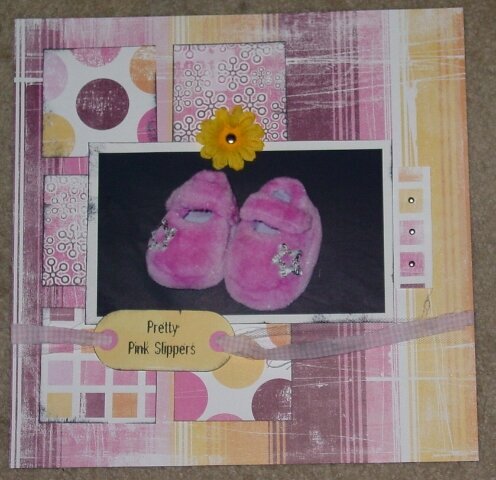
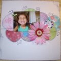
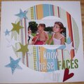
I used the sketch from Cathy Zielske's new book Clean and Simple, as provided to me from ALiciaM! There is journaling behind the squares on the right that pull out. THe journaling reads "Nonni bought you the prettiest pink slippers. You love to walk around the house carrying your slippers!. It’s probably too hot for them right now, so you carry them instead of wear them! But you are so proud of your pretty pink slippers that Nonni bought for you."
Does this project or one of it's images contain pornography, profanity, or other illegal or offensive material? If so, please report it and our moderators will come by and clean it up in a flash.
January 22, 2005
January 05, 2005
January 03, 2005
January 03, 2005
January 03, 2005
January 03, 2005
January 03, 2005
January 03, 2005
October 28, 2004
October 27, 2004
October 25, 2004
October 25, 2004
October 25, 2004