
Happy National Scrapbook Day!
Extra 10% OFF Select Scrapbooking Brands with Code: NSD24
Extra 10% OFF Select Scrapbooking Brands with Code: NSD24
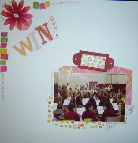

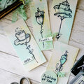
 Give a Cheer
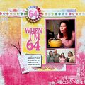
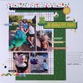
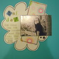
I'm not really sure if I like the way this came out. I did try to use patterned paper, though. Just so you know, the words "Hershey Park 2006" are written in that label holder with green gel pen. It can be seen easily, but not in the photo. I'm just not sure about this. I do like it better in real life, but the judges won't see the actual thing. Once again, this is a photo. When I did this, I wanted it to reflect me in a way. I wanted it to be playful. I wanted just....I don't know. I like it, but... I don't know....
No products have been added to this project.
Thanks for spreading positivity!


May 05, 2007
April 25, 2007
April 22, 2007
April 20, 2007
April 17, 2007
April 16, 2007
April 15, 2007
April 15, 2007
April 13, 2007
April 11, 2007
April 11, 2007
April 10, 2007
April 07, 2007
April 04, 2007
April 04, 2007
April 03, 2007
April 02, 2007
April 02, 2007
April 02, 2007
April 02, 2007
April 01, 2007
April 01, 2007
March 31, 2007
March 29, 2007
March 29, 2007
March 29, 2007
March 29, 2007
March 29, 2007
March 29, 2007
March 29, 2007
March 29, 2007
March 29, 2007
March 29, 2007
March 29, 2007
March 28, 2007
March 28, 2007
March 28, 2007
March 28, 2007
March 28, 2007
March 28, 2007
March 28, 2007
March 28, 2007
March 28, 2007
March 28, 2007
March 28, 2007
March 28, 2007
March 28, 2007
March 28, 2007
March 28, 2007
March 27, 2007
March 27, 2007
March 27, 2007
March 27, 2007