I would want to make the left side pic stand out more. it seems a bit off balance with all the stuff going on in the right. the ribbon and buttons aren't doing it for me when against those large shamrocks. I like how the title balances out the page at the bottom
Candi, I really like this page, I think the strip of blue/green pp and the strip of polka dot pp with the brads really gives the page motion-which is cool since it is a running page:) I do think maybe a splash of green on the right side would be good, but really I like this lo!
Looks like you are off to a great start. I think that you need to add the brighter green to the right side of the LO to tie it together. Maybe another shamrock too. Make a triangle? I always like to work in odd numbers.
I really like this LO. The title is really cute and the individual pics are a great idea! The only thing I would look at altering issomthing to make your big pic stand out more. It almost blends into the black background. So maybe Matting that even if just a thin one. And I totally shouldn't be allowed to say this but some journaling somewhere about the run or who the people are.
Candi, I like it just the way it is. I like the title centered in the middle and the page flipped over with the eyelets. I like the design with the little pictures of the guys. The added ribbon and shamrocks are perfect. I wouldn't change anything.
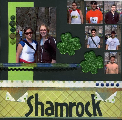
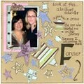
The LaSalle Shamrock Shuffle is an 8K the my DH and his buddies run every year...so I highlighted all of the important people..including the sideline cheerleaders!
Does this project or one of it's images contain pornography, profanity, or other illegal or offensive material? If so, please report it and our moderators will come by and clean it up in a flash.
April 07, 2007
April 06, 2007
April 05, 2007
April 05, 2007
April 04, 2007
April 04, 2007
April 04, 2007
April 04, 2007
April 04, 2007
April 04, 2007
April 04, 2007
April 04, 2007
April 04, 2007