I really like this lo and the colors are perfect but there is something about the flowers? Maybe because they are not inked like the rest of the page???
I don't see where you have any room for an apostrophe in your title without making it stick out like a sore thumb and you want people to notice the title, not the punctuation. I would leave that alone. I would have lost one of the flowers completely and just kept the one in the lower/left corner and added a "bouquet" of smaller flowers in different colors around it. Rhinestone center in the big one for sure and brads in the centers of the rest. I also see 3 brads in pink running horizontal to the pic inside of the brown mat from the right edge coming in toward the left about 1/4 of an inch apart (maybe even a little less depending on the size of the brads, althought I recommend small ones). I am seeing pink there. This is really pretty though the way it is and I love the PP and the picture is awesome!
So adorable! I love the color scheme here and am loving the title... I feel like something more is needed though. I'm seeing some flourishes that start to the right of the picture and go up and around and the photo and then down and around the photo...
I love that title, vertical titles are awesome, imo. I think If you put the bottom flower under the picture, on the right side, so its diagonal from the other flower. And add the rhinesontes mentioned would look great. Id love to see some journaling, maybe even some strip journaling on the bottom left. You could even do brown paper and journaling in white like the title.
Fabulous photo & pp! The rhinestones in the flowers will look great. I'd also like to see some journaling & agree that you need the apostrophe in the title. Otherwise, great LO!
Love the photo, love the pp and great title! I think you should keep just one flower-the once on the left-the top one. Or you can keep the top left flower and cut the other one-just the flower and put it in the lower right corner on the brown mat( the one under the photo). i think the rhinestones for the middle of the flowers will look cool.Can't wait to see the finished one!
Pretty colors, pretty pp, nice inking touches, and great photo. That said, I think the photo needs to be emphasized. Englarge it and make it more a focal point. With all those great pps out there, we forget that our pages are about our memories, not the products. Also, slide that brown mat over to the left, as Katie suggested, so that it overlaps that thick brown stripe halfway. Or you might consider X-acto knifing out the outline of the white and beige flowers behind the brown mat so that they come up over it. Whatever you choose, if you enlarge that photo, keep in mind your brown mat will be thinner which is okay since you have a thick brown margin for your title. Now the title--don't forget your apostrophe and try a rhinestone for the dot on the i. Also, see those dots that form a flower next to the first a? I'd like to see that same pink flower 3 times staggered above Girl, with one even bleeding off the page, and maybe one more bleeding off the bottom corner. Your pink flowers will look even prettier with rhinestones, but the pink still appears flat. Try inking them in white to give them dimension. As for journaling, this is one of those pages I don't think requires it.
I love this paper - it's so lush. I think maybe if you moved the brown mat a little further to the left it might let the pp shine through a bit more without losing the mat itself. I wouldn't mind seeing some journaling somewhere here too.
Christy, this is beautiful! I love the papers and the chalking of the photo mat. The rhinestones will look way fab! I think I might like the top flower a little lower and make it rest on the corners of the each photo frame. The picture is adorable and this LO rocks! Looks like Christy has her scrappin' mojo back!
Loving this pp, the picture is adorable. I'm not sure I like both of the flowers on the left. maybe just one would be better. rhinestones would make a nice touch.
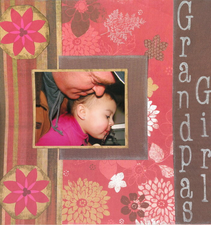
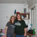
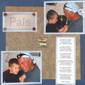
This is my DH with our Ariana, lifting her to get a drink from a water foundtain. It is one of my fav pictures. The scan is not good, towards the center of the picture the lines on the left "bend" due to scanning only, they are linear irl. 
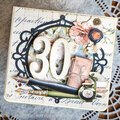
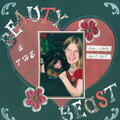
I think I am going to put a rinestone in the middle of each flower on the far left.
Does this project or one of it's images contain pornography, profanity, or other illegal or offensive material? If so, please report it and our moderators will come by and clean it up in a flash.
October 07, 2007
July 02, 2007
April 24, 2007
April 22, 2007
April 21, 2007
April 21, 2007
April 17, 2007
April 17, 2007
April 15, 2007
April 15, 2007
April 15, 2007
April 15, 2007
April 15, 2007
April 14, 2007
April 14, 2007
April 14, 2007
April 14, 2007
April 14, 2007