


Happy National Scrapbook Day!
Extra 10% OFF Select Scrapbooking Brands with Code: NSD24
Extra 10% OFF Select Scrapbooking Brands with Code: NSD24


 Give a Cheer
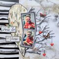
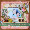
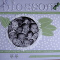
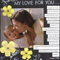
just a page with one of our professional pictures from Sears. I am not sure what to do with the space on the left of the pic-should I just leave it there, it looks wierd to me.
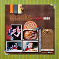
Thanks for spreading positivity!


December 31, 2007
June 14, 2007
April 29, 2007
April 27, 2007
April 27, 2007
April 27, 2007
April 27, 2007
April 27, 2007
April 27, 2007
April 27, 2007