I love how you did the names! I also like the idea of doing 2 different ribbons, maybe don't make the bottom one go all the way to the bottom of the page.
I like the LO. Maybe you could doodle around the pic so that it will stand out more. Maybe use a white pen or some rubons. I also like the idea of one ribbon going up and one going down. That would give it a good balance. It feels bottom heavy.
i didn't even notice the hole until outside chic's comment.. whatever.. love the way u did the names and i understand now what u were trying to accomplish now that i've seen it.. still not sure how to achieve that look
larger picture maybe? i like the lo though. it makes you look up everything is leading up, what is there to bring you back down? maybe switch the ribbon so one comes down and one goes up. and the hole on the top of the page???
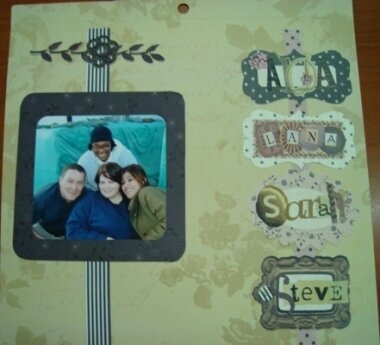
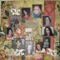
I absolutely HATE this. It looks like nothing I imagined in my head. The concept I was shooting for, was framed photos on a wall suspended by a ribbon. Like you might see in your grandmas house or a Victorian setting. It totalyl failed for me. The photo is special to me as it is some of my friends. The lady at the top is a construction rep, the young lady is an Iraqi associate, the man is one of our darling Thugs (security) We were watching a horse shoe game when we stopped to pose. The ever present green encased sand bacgs stacked behind us.
Does this project or one of it's images contain pornography, profanity, or other illegal or offensive material? If so, please report it and our moderators will come by and clean it up in a flash.
May 16, 2007
May 02, 2007
May 01, 2007
May 01, 2007
May 01, 2007
May 01, 2007
May 01, 2007