Storage & Organization up to 60% OFF!
Plus, a FREE Gift! | Details Here.
Plus, a FREE Gift! | Details Here.

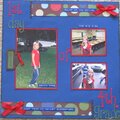
 Give a Cheer
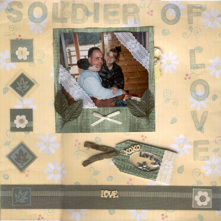
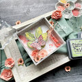
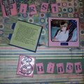
This is me and my husband a few days before we were married. Note the hidden tag that includes the info. about this pic. it is behind the photo.
No products have been added to this project.


Thanks for spreading positivity!


January 28, 2005
January 22, 2005
January 10, 2005
January 07, 2005
January 07, 2005
January 06, 2005
January 06, 2005
January 06, 2005
January 06, 2005
January 06, 2005
January 06, 2005