More fun photos from Sharon. That textured bg cs is so cool. I like the title, too, as well as the font, the matting, and the brads. I recognize the additional 3 pps from that same value pack we have. However, I don't think they mesh well with the ones from the kit. There's also that age-old issue within our group about matting all or none at all. I have to say, Sharon, that this page, as a whole, is not the best representation of that style of yours that we have all come to know and love. I'd challenge you to step back and take a good, hard look at photo placement first and consider pushing some paper around.
I would use the paper used to make the swirly in the middle of the page to matt the photos to make them POP off the page. I love the photos, love the title, great job!
The way you utilized the ribbon is great. I would mat the photos though. They are getting lost in the background paper. Otherwise, love how you used all the materials!
This LO is really fun! Love that you turned the PP into swirls. I am also really diggin your use of ribbon. Something about the way you made a ribbon stretch the whole page at the top and bottom and then used the pp strips and ribbon only to peek out from the side Love it! I do suggest some form of matting for the pictures to help them stand out a bit more.
Love the title, it's so much fun. I would mat, sand, paint the edges of the photos only because the background is soo dark that they kind of get lost. I would also cut the end of those strips into triangles to give some fun shapes.
Love how you utilized the materials. The placement of everything is great. I would mat the photos.. in that burgendy color of that pp in the top right, a deep green, or a dark color that coordinates. Love the little swiliries, and everything else to added to the kit. Can't wait to see the other half
I think I would mat the photos to make them a bit more grounded. I'm also not crazy about the journaling block being behind that top photo, but that may just be because it was my favorite item in the embellie package lol.
Sharon, I never cease to be amazed at your wonderful use of multiple photos. You make it look so easy! This LO is fabby! The title is positively perfect! Catchy, short, and relevant. I love the deep, rich colors you chose to complement the embellies that we were assigned. It most definitely has a wonderfully fall/Thanksgiving Day feel! The ribbon and patterned paper "laces" are rad and the background paper most definitely is pigskin-ish and adds to the whole theme. I love that you used some additional brads that look bronzed to balance the blingy brads. I am sooooo diggin' the swirls. They really do a great job of filling space and help tie the whole thing together. The only thing I might have done differently (not necessarily suggesting it) is mat the photos. However, you are so the Queen of Inking (not to be confused with the Queen of Inkling, one county over) that I think they work the way they are. Ab Fab!
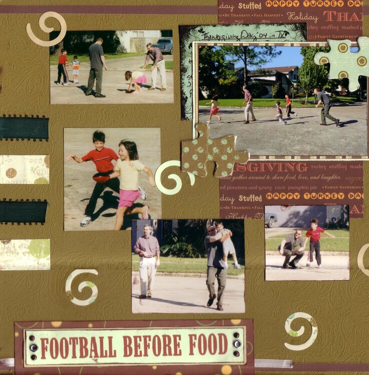
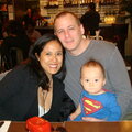
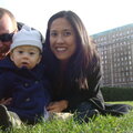
This is my response to Melissa/Fiery Redhead's embellishment challenge for SHCG. We were all given puzzle pieces, pp, journaling panel, 2 silver brads, heart clip and ribbon, and told to use 90% of those on a LO. I used everything but the heart clip and 2 puzzle pieces, covering the other 2 puzzle pieces w/ pp and using them as photo corners. This page is about the 1st part of Thanksgiving Day '04; we gathered at my childhood home in TX. Before the big feast, we ran errands then my sister and I watched DH, my brother-in-law, 2 of my nephews and my niece play football. Journaling panel pulls out from behind the group action shot to say "Thanksgiving Day '04 in TX - Woke up early to make Dept. Store Urban Myth cookies. Greg and I went to Walmart w/ the kids - they were soo good and well-behaved. Greg defied store policy by video taping. Then Sally and I watched Jon, Greg and the kids play football. Beautiful day, wonderful company and a great time in from of our (Sally's and my) childhood home, before the big meal." (The meal will be covered in another pg). The ribbon on the left is conceptually suggesting the lacing on a football. Also, the base paper is textured with a paisley pattern that is vaguely reminiscent of a football shape. (Note the scan cuts off the right side a bit and the stitching cut into one of the spiral punches). This was so fun to do! TFL :)
Does this project or one of it's images contain pornography, profanity, or other illegal or offensive material? If so, please report it and our moderators will come by and clean it up in a flash.
June 26, 2007
June 16, 2007
June 12, 2007
June 11, 2007
June 11, 2007
June 11, 2007
June 11, 2007
June 10, 2007
June 10, 2007
June 10, 2007
June 09, 2007