shcg: beautiful page, i love the colors for the bg paper. it brings out the hues in the b&w picture. the only thing i can think of that would do anything for this page is a small title. it is really beautiful the way it is.
I particually enjoy seeing your older photos. You seem to do such a great job at letting the photo being the star and keeping it simple. I would suggest maybe moving the journal box to the opposite side though, to make it flow a bit better.
I'm loving the way you portray heritage. It's a little untraditional in that you don't go straight for the browns and rose colors or crumped aged papers... You go more for things that would have been stylish to them at the time. Way more period than I would have even thought of.
Love the purples in this page. I think I'd move that little journal box to the same spot, just on the right side. It's just i think because of the floral background that it's distracting. Love the 2 pp's together. another great photo
I happen to love this - love the rich feel that the photo combined w/ the pp convey. Again, awesome way to convey an antiquey feel solely by pp & without crumpling, distressing etc (which would be fine if you did but you didn't!). Honestly, I'm cool w/ everything here as is, awesome work!
Beautiful PP's and awesome LO, I really like this the way that it is except I think a solid black swirly across the bottom right of the page would really set it off!
Loe the lace frame and border, it's a great look. I like how you managed to put some purple in there cause I find it difficult to scrap with purple. I kinda agree with Bren. I would like flower on either side of the photo and stripe underneath it.
The only thing here for me is the right bottom corner-needs something-ribbon, metal embellie or some of the white flowers from that lace.The photo is way cool!
Such rad colors on this one. Absolutely beautiful. Now, I have to agree with Brenda. I want that floral paper to only take 1/3 of the LO. That lace to the side of the picture is beautiful. I think it is because of the border at the top, but I want something horizontal at the bottom. I think black ribbon that goes the length of the LO and tucks under the journaling possibly. Not sure. Love this and lemme tell you...I am lovin' the looks on their faces. Scandalous!
Nice colors, elements, and patterns. I do have to invoke the rule of thirds here, though. As is, the pps look like they're bisecting the page. My only suggestion would to then have 1/3 of one pattern and 2/3 of the other.
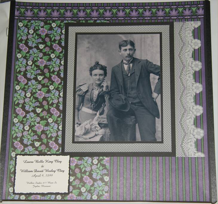
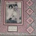
Continuing in my Heritage Album... All photos in BW with Patterned Papers and cardstock in shades of Purples, Pinks, Browns and Black. Housed in a CM Rose Tapestry strap-hinged album.
Does this project or one of it's images contain pornography, profanity, or other illegal or offensive material? If so, please report it and our moderators will come by and clean it up in a flash.
July 13, 2008
September 14, 2007
June 26, 2007
June 21, 2007
June 21, 2007
June 20, 2007
June 20, 2007
June 20, 2007
June 20, 2007
June 19, 2007
June 19, 2007
June 19, 2007