I love the colour scheme nd that is not a sporty theme. I really like the placement of the photos/pp/elements. I really like the journalling! great job!
this is a neat layout. I like the use of the circles and squares. I like how you wrote along the edge of the circle. This is very well balanced. Good job!!!!
I love that you took a sports theme but did not give it that sporty look. If you didn't intentionally take those 3 pics in that sequence, lie and say you did! It is such a cool idea! This page definitely has a lot of interest to it. The Swing stamps look like your own doing, and I bet the shape of that polka dot pp is an original creation of yours. The only thing I'd change would be to remove the black flourishes, baseballs, and white connecting strands that run diagonally between the photos. They distract me a little bit, and they don't appear to be necessary. I'd probably move the white baseballs in their spots instead. Another thought: I wonder if you just switched them out, rather than eliminated anything at all...
I am so digging the color scheme you used. So not baseball - but it works perfectly! The matting is also something that helps 'make' this layout work. The only thing I notice that might need to be changed is the (!) at the end of the title. The white really stands out. Other than that, you have hit a home run on this one! LOL
Loves these colors. Love how your mattings match and how my eyes are guided across the page and all of the different fonts. Melissa, you are getting sooo good!
This is excellent Melissa! Love the muted greens & blues, the shapes behind the photos, the doodled dots & the photos of different phases of swings. I am thinking maybe ink the outside perimeter in a dark ink. I am also seeing something around the title to make it stand out more... perhaps some doodling around it? But I am so loving this already as is!
Melissa, I love this. Ever since I was a kid, I have loved pictures behind chain-link fences. I think it is because we played so much softball and baseball when I was little. So, this is right up my alley or in my strike zone, as it were. First of all, I am soooo diggin' the symmetry of this. You always have a knack for making a LO seem balanced. Love that! I love the swirly background paper with the dotted line circles. It makes me think of motion and it is perfect for this subject. Also, you totally rocked the title, not only in concept but in font and placement, too. Perfect. Not sure if you planned this or not, but the way you chose three pictures that take us through a complete swing is genius. I'm tellin' ya'. I don't think that I would change one thing. This one is a home run! Outta the park!
Melissa- I absolutely love the way it turned out. I love the squares behind the pictures.. they really add to the page. I love how you have all of the sharp edges, and soften it up with that big circle. THe stamped title fits perfectly with this LO. Love all of the inking, and all i can suggest is to ink the circle and background pp as well. That would be your main "technique" for the innovative. I really like this LO.
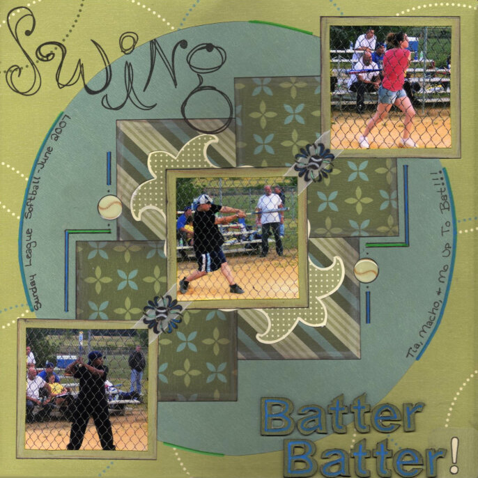
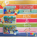
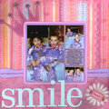
This LO is for the Lucky 7 Contest... Tia and our friends (Macho & Mo) play softball in a sunday league so I'm always there to cheer them on and take pictures. I finally got the idea to scrap the pictures! DUH! I originally had a totally different direction in mind for this LO (thanx Tiff for finding those pictures), but couldn't get it to go the way I wanted so this is where I ended up going with it.
Does this project or one of it's images contain pornography, profanity, or other illegal or offensive material? If so, please report it and our moderators will come by and clean it up in a flash.
November 20, 2007
July 06, 2007
July 05, 2007
July 04, 2007
June 28, 2007
June 26, 2007
June 26, 2007
June 25, 2007
June 25, 2007
June 25, 2007
June 25, 2007
June 25, 2007
June 25, 2007
June 24, 2007
June 24, 2007
June 24, 2007
June 24, 2007
June 24, 2007