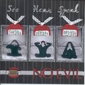
Thank YOU! It's Customer Appreciation Week!
EXTRA 11% OFF Orders $100+ With Code: THANKYOU
EXTRA 11% OFF Orders $100+ With Code: THANKYOU

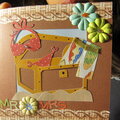
 Give a Cheer
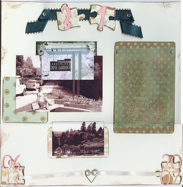
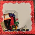
This is for Melissa's (Fiery Redhead) Member-Hosted SHCG Embellie Challenge. She sent us a kit of supplies with two requirements: use 90% of the items and a solid color cs. It didn't turn out to be as easy as I thought; it was truly a challenge. This lo must have gone through 3 or 4 reincarnations before I finally settled on this one. It also marks my first time working with chipboard. The quote stamped on the vellum reads: "We bring Roses, beautiful fresh Roses, Dewy as the morning and coloured like the dawn; Little tents of odour where the bee reposes, Swooning in sweetness of the bed he dreams upon." --Read It shows up better IRL, and the cs is actually a creme color, not the white that it seems here. There's also journaling behind the solarized picture of the Berkeley Rose Garden sign.
No products have been added to this project.


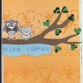
Thanks for spreading positivity!


July 31, 2007
July 04, 2007
June 28, 2007
June 26, 2007
June 25, 2007
June 25, 2007
June 25, 2007
June 25, 2007
June 25, 2007
June 25, 2007
June 25, 2007
June 25, 2007
June 24, 2007
June 24, 2007