This looks really good. I really like the pp and the hidden journaling. I really like all the different layers and the ribbon work well. I wouldnt change a thing about it!!!
Jen, I love this! The layers and ephemera-esque feel to it is perfect. The colors, the picture, the placement, and the title in this all rock! Hey, it better rock it is Beatlemania, after all. I would ink the outside of the page in either the chocolate color or the pink. However, I wouldn't change one other thing. It's got ALL MY LOVIN'!
Awesome job with the challenge! There is sooo much going on here, and yet I don't feel as though it is busy. It just all works perfectly together. I do however agree with K about the staples. They don't really go with the feel of the LO.
Wow, I am swept away into a nice romantic place w/ this LO, Jen - what a fabulous response to the challenge as well as this week's design idea! LOVE this, love all the inked hearts, the ribbon, paper tearing, b&w photo...such a nice assortment of pp. You know, I like the staples, they add to a vintagey "leather n lace" feeling for me. OK what I'd add - inking around the entire perimeter, the same ink you use on one of the hearts, just to tie it all together. And maybe inking the word "you" (or more inking if it is already, can't tell) - considering all the inking on the other letters, I don't want such an important word to not be emphasized as well. I love how you used a lyric line for this challenge. Amazingly lovely LO!
(Gasp!) This is so romantic and sweet, Fitz! I love it; it's beautiful and attention-getting. That photo makes me feel a little voyeuristic in a wistful way. You did a great job on the layering, tearing, inking, and embellies. I like the pps, the colors, and the ribbons. I also like the metal heart embelly and the Ghost Shape Heart in this lo. K and I must be on the same wavelength because I, too, think the staples are too severe for something so soft. I'd like to see people do something other than staple Ghost Shapes and ribbon vees, like sew, I guess. I like the hidden journaling spot, btw, but I'd like to see the ribbon vees above it, moved up on that mocha colored heart away from its lacy pattern.
Wow .. I love the sentiment coupled with the photo. And those colors just highlight everything.
You TOTALLY got the rule of thirds and I like how you used it here to make us focus on that smoocher of a photograph. My only thing is that I would remove the staples cause I feel they're too rigid for this soft layout and the ribbons in the bottom right hand corner because they don't emphasize anything :)
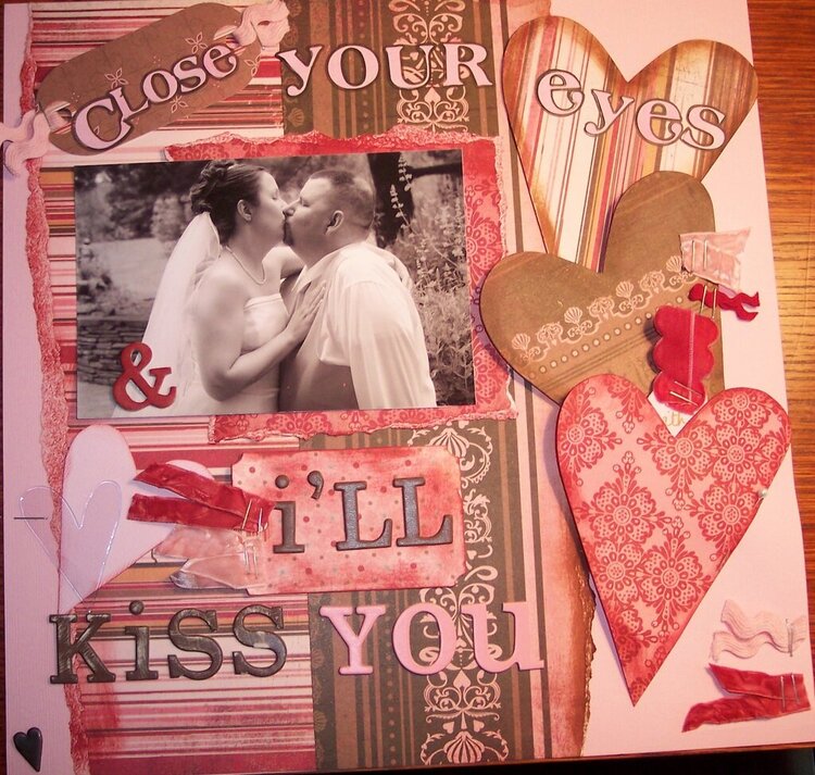
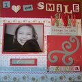
This is for the Beatles challenge. I used a lyric from "All My Loving". I also tried to use the rule of thirds for this layout. There is a hidden journaling spot that pulls out from behind the bottom heart.
Does this project or one of it's images contain pornography, profanity, or other illegal or offensive material? If so, please report it and our moderators will come by and clean it up in a flash.
July 24, 2007
July 04, 2007
July 02, 2007
June 29, 2007
June 28, 2007
June 28, 2007
June 28, 2007
June 28, 2007
June 28, 2007
June 28, 2007
June 28, 2007
June 27, 2007
June 27, 2007
June 27, 2007
June 27, 2007
June 27, 2007
June 27, 2007