Very creative use of colour!! Looks good on the black background, definatley draws the eye in with the white border, perfect place for your journaling too.
I miss the journaling. I would suggest hidden journaling about how you felt being in the rose garden where you married and how you are happy. I love the rub ons.
You know, all I feel I have left to do on comments lately is nit pick (and I had lice once so it's bringing back bad memories...um, thanks?!) Really, really my only suggestion based on what my critique eye is saying is to make the jewels at the top & bottom the same distance apart--I'm being distracted by the different distances. C'est tout, though; your transparency effect is superb!
Wow, brenda. Love this! The way you did the colors is so creative. Love the title and the little jewels. you look so happy and pretty here! lovely place, lovely photos, and a lovely LO!
Holy wow .. I have never seen anything like this before. Never. You're like warhol :) and you're so very pretty. I think I have a crush on you! *ahem* Your photo placement is perfect, the matting is awesome as is your title. Love teh doodles in the corner and love it all.
Color ME happy to have so many LOs posted from my lovie, Brenda! This is awesome. I love the innovative effect with the primary colored transparencies and then overlapping to create the secondary. Beautimus. The pictures are, of course, striking, you vixen. What really struck me is that this looks like a LO within a LO. I love your handwriting and those doodles. Are they handdrawn? The spacing on the COLOR is a little too broad for me, but I think that is a personal preference. I just want a little less space between the letters. What a great LO to show what a great birthday-day you had with your sweetie. Fabby!
Ooh this is so clever & cool, Brenda! I LOVE your technique here of printing on primary colored transparencies & overlapping them to create secondary colors, that is too freakin RAD! The photos are beeYOUteeful, love the multicolor title, gems & corner swirlies. And of course, your gorgeous handwriting. If I had to pick anything to critique, I could kind of see adding some doodling dots in the letters in "me" to highlight them, either just gold dots or multicolored dots that coordinate w/ the colors in the title (the "me" gets slightly lost to me, perhaps because I'm so taken by the colors everywhere & the gold "Happy"...but maybe it's just me, argh, pun not necessarily intended). But darling, I do love this already as is!
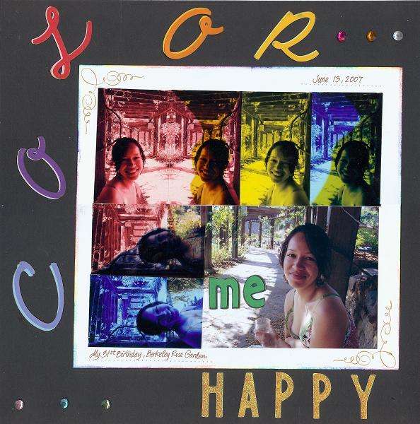
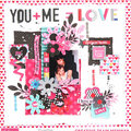
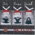
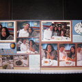
This is for the SHCG Week #23 WC which was to create a lo to enter in the Use of Color category for the Lucky 7 Contest. The solid color photos are printed on transparencies. I printed them in the primary colors and overlapped them to make their secondary colors. My schrubby took these pics during our picnic, on my 31st birthday, in the Rose Garden where we married almost 7 years ago.
Does this project or one of it's images contain pornography, profanity, or other illegal or offensive material? If so, please report it and our moderators will come by and clean it up in a flash.
August 02, 2008
April 08, 2008
November 20, 2007
August 10, 2007
July 31, 2007
July 23, 2007
July 19, 2007
July 13, 2007
July 11, 2007
July 09, 2007
July 09, 2007
July 09, 2007
July 09, 2007
July 09, 2007
July 09, 2007
July 08, 2007
July 08, 2007
July 08, 2007
July 08, 2007
July 08, 2007
July 08, 2007
July 08, 2007