FREE Standard Shipping on Orders $69+ with code:
FREESHIPPING

Cheers
Give a Cheer

 Give a Cheer
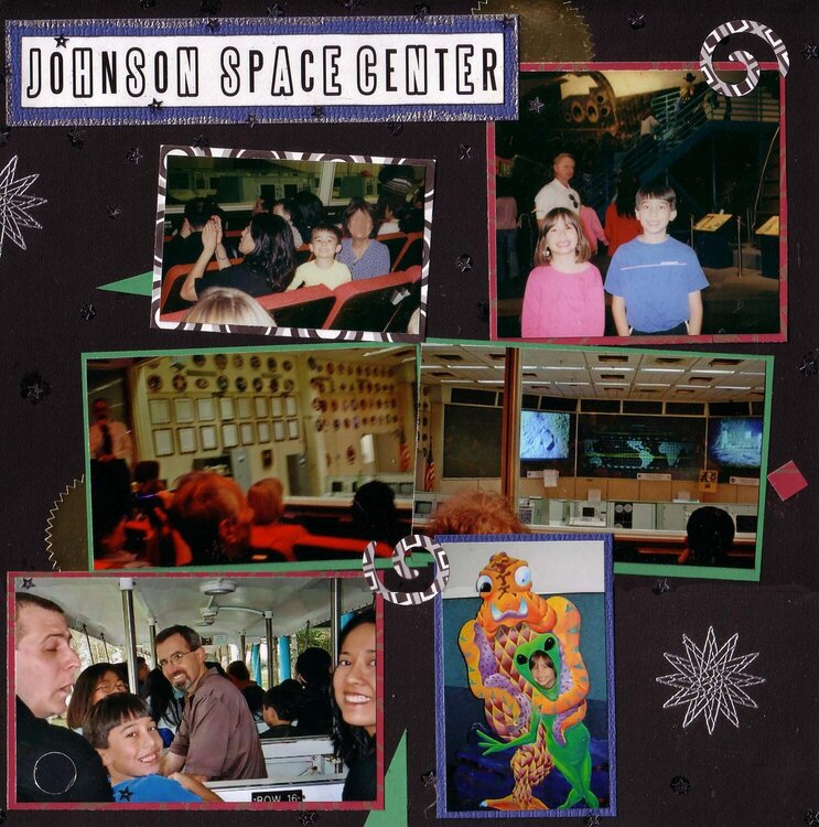
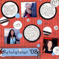
This is my response to my SHCG Stashoffont Challenge to create a LO that uses: old STASH paper(s)/embellie(s), something from an OFFice & a word in 2 different FONTs. Excuse my blurred parents, they prefer blurred anonymity (lest their secret identities as nighttime ballroom-dancing-superheroes be revealed to the masses!). Stash items: DCWV Black & White Stack & Club Scrap's Reflections kit (I always thought Club Scrap's glossy blue & red paper combined w/ gold etching was an awkward combo; thought silver would've been better) & star stamp; Office items: gold notarial seals (used in my office as a base for corporate seals on certain docs), notepaper & paper clip; & 2 font title. To carry out my vision of silver w/ those papers, I bordered the title & big photo w/ silver embossing, scattered silver star sequins & partially embossed the star cut from the red pp (wanted some of the gold outline to show). These scans don't capture how shiny the embossing, seals, sequins & paper really are (the circles of blue glossy paper look black here). The big photo is a pocket that contains a brochure & journaling. This LO depicts part of an annual get-together w/ my immediate family, who all live in different states (my brother's family couldn't make it).
Because I wanted to use so many photos, I didn't feel like I could express K's Flow design tutorial fully, but I did do a few things to concentrate focus on the title & big photo (wider mattes, more stars, embossing, that big star cut out).
For journaling, see separate scan of hidden journaling detail.
TFL! :o)
No products have been added to this project.


Thanks for spreading positivity!
%20-%20Scrapbook.com)


July 28, 2007
July 26, 2007
July 22, 2007
July 16, 2007
July 13, 2007
July 13, 2007
July 13, 2007
July 13, 2007