
Happy National Scrapbook Day!
Extra 10% OFF Select Scrapbooking Brands with Code: NSD24
Extra 10% OFF Select Scrapbooking Brands with Code: NSD24

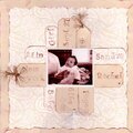
 Give a Cheer
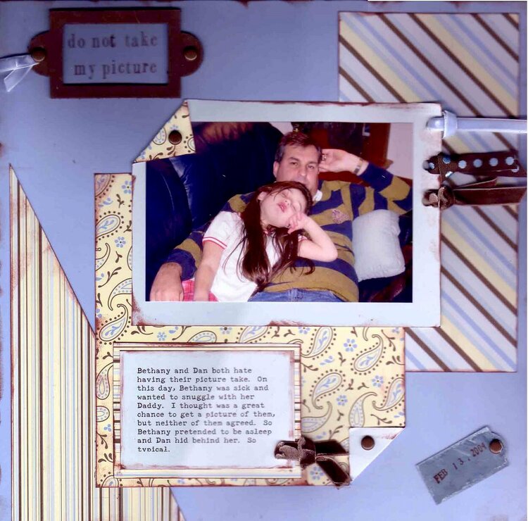
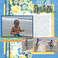
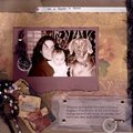
This is a pic I just took of my DH & DD this weekend - neither of them happy about my taking the shot. But did I let that deter me - NO WAY...
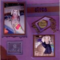
I don't like the tag in the bottor right corner - it seems to be missing something. Like it's floating out in space. Any suggestions?
Materials:
* MM - cosmo blue paper, cosmo ribbons, leather bookplate, magnetic stamps
* Brilliance inkpad
* Joann's brads & metal tag
THANKS!
No products have been added to this project.
Thanks for spreading positivity!


February 15, 2005
February 15, 2005
February 15, 2005
February 15, 2005
February 15, 2005
February 15, 2005
February 15, 2005
February 15, 2005
February 15, 2005
February 15, 2005
February 15, 2005
February 15, 2005