SHCG: How adorable is he? I love the strip of photos on the right and the threes are perfect. I would like the brown ones to stand out a bit more, perhaps inking or a mount would work. My only suggestion, other than that, is maybe inking the baby blue squares around the edges to distress them a bit. I love this page!
SHCG: Great response to the BWC. He sure is a little ham! So cute. I love all the threes in this page and the color scheme. I would suggest moving "Faces" up to the same square as "Silly" and then using the other square for journaling. I would possibly even ink the squares and let the second square overlap the bottom photo a little.
SHCG: Great response to the BWC! I love all the 3s, the patterns, and the colors. I adore the photos! He's a male model in the making, and I think the candid expressions are what make this page special. I'm offering very tentative suggestions because I can't get an enlarged look at your lo. Maybe a white outline to the brown 3s and white polka dots on "three." I also like the idea of a little bit of journaling, but the size of "Silly Faces" really doesn't bother me. Maybe just add one big button next to "Silly" where it meets "Faces" and overlapping the pp mat.
SHCG: i love the colors and how fun this layout is., The like Sharon's idea of making the silly faces strips a bit smaller and I would like to see the blue star outlined with the orange.
SHCG: This page is adorable! Great answer to the challenge. I love how you used the number three and also spelled it out in orange which pops off the page. The buttons give it a nice touch and he is a cutie for sure. If i was going to suggest something, I would suggest at least a little bit of journaling somewhere, if only name, date & age of your subject.
SHCG: I love this page. The "threes" all over the page are fabulous and the pictures are super cute! At first glance I would not change a thing, but then I read the other comments and realized that maybe changing the blue strips of the silly faces is a good idea. Even adding more buttons around your words might work...or inking the edges a bit.
SHCG: These pictures are so much fun, and so are all of the colors to go with it!!! I love all of the different fonts for the threes. Love those buttons up in the right corner, but think I'd leave it at just three and make it like a photo corner. Love the handwritten part of the title, but think the strips could be made just a little thinner. Really great answer to the challenge
SHCG - How fun are these photos & this LO! Great response to the challenge. I really like that you handwrote the title to provide a different look here, however, I think the blue strips are cut too large around your writing. I think cutting those pieces of paper down more so that they're more like wide strips than blocks, maybe even matting them in pp, would create a more balanced look. I love the playfulness you convey here w/ the colors, embellies & number 3's. Very cute!
SHCG: So cute! While you truly do have wonderful handwriting, I would consider computer printing or cricut cutting or something in very small letters the remainder of the title (silly faces) - I think it would unify the page even more. (Otherwise, I am all for handwritten journaling as I do it myself all the time...)
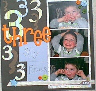
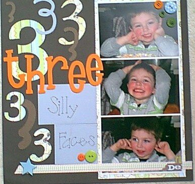
This is my son's idea of a photo shoot. Sitting at the table trying to eat dinner... "Mama take pictures of me" wonderful! Now if I could just get him to look at the camera when I want him to we'd be alright!
Does this project or one of it's images contain pornography, profanity, or other illegal or offensive material? If so, please report it and our moderators will come by and clean it up in a flash.
April 06, 2008
March 03, 2008
March 03, 2008
February 23, 2008
February 21, 2008
February 20, 2008
February 19, 2008
February 18, 2008
February 18, 2008
February 17, 2008
February 17, 2008
February 17, 2008
August 16, 2007
August 09, 2007