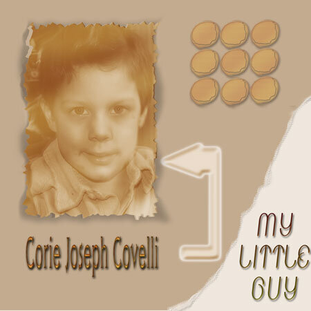
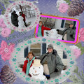
SHCG: Marsha, I am totally digging the sepia tones that you used here. I would love to know an exact date...even a "circa" would be good. Finally, I think I would like the photo matted on a white or a shadow. This is a great picture and layout.
SHCG: I really like this LO Marsha! I think it is wonderful as is, but I wouldn't mind seeing a pop of color or some small embellies around the photo to add some interest to the photo. The photo is great, BTW!
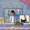
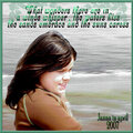
SHCG - This is such a calming, lovely page. I really love the neutral palette & how the lighter corner is a contrast, adding a nice emphasis to the phrase "my little guy." I'd make the shadow around the pic a deeper shade, for added emphasis on the pic (otherwise, my eyes are drawn to those interesting circles). I also like Brenda's idea of adding an age & year. Also, I agree the arrow is fine. I'm fine w/ the fonts as is. Very nice LO, Marsha!
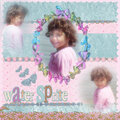
SHCG: I love how you branched out into this this very neutral-toned LO. I really like the colors and especially the photo's edging and how well it's shadowed. I agree with Brenda that the arrow is absolutely fine, with some modification, if possible. Also, I agree on the font size change of the name. Some shock of color would be a wonderful addition to give a bit more of a completed feel to this -- I feel like there's something missing but am unsure as to what.
SHCG: I like the deco edge to the photo, and the nine circles bring interest to the page. I also like the shadow effect behind the photo, but I'd add two more layers of different color pps set askew. Since the entire page has neutral tones, the overall effect comes across as flat. A touch of color, even if they're deep, rich tones, will bring more attention to your focal photo. I actually like your arrow choice, but I'd blur the beveled edges. Your title is sweet and I like the contrasting fonts between that and the name, but I'd make his name smaller so that they don't compete with each other. Finally, I'm left with wanting to know more about your little guy. It might help to add his age and the year aligned left over those nine circles, in a small font.
SHCG: Way to step out of your comfort zone and create a page unlike most you create. I want to see something else though on this page of a different color... to bring it all together. I just don't know what that is though.
Does this project or one of it's images contain pornography, profanity, or other illegal or offensive material? If so, please report it and our moderators will come by and clean it up in a flash.


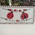
 Give a Cheer


February 19, 2009
January 25, 2009
January 14, 2009
January 11, 2009
January 05, 2009
January 01, 2009
December 30, 2008
December 30, 2008
December 30, 2008
December 30, 2008
December 30, 2008
December 30, 2008
December 30, 2008
December 30, 2008
December 30, 2008