FREE Standard Shipping on Orders $69+ with code:
FREESHIPPING

Cheers
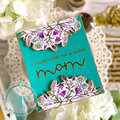
Give a Cheer

 Give a Cheer
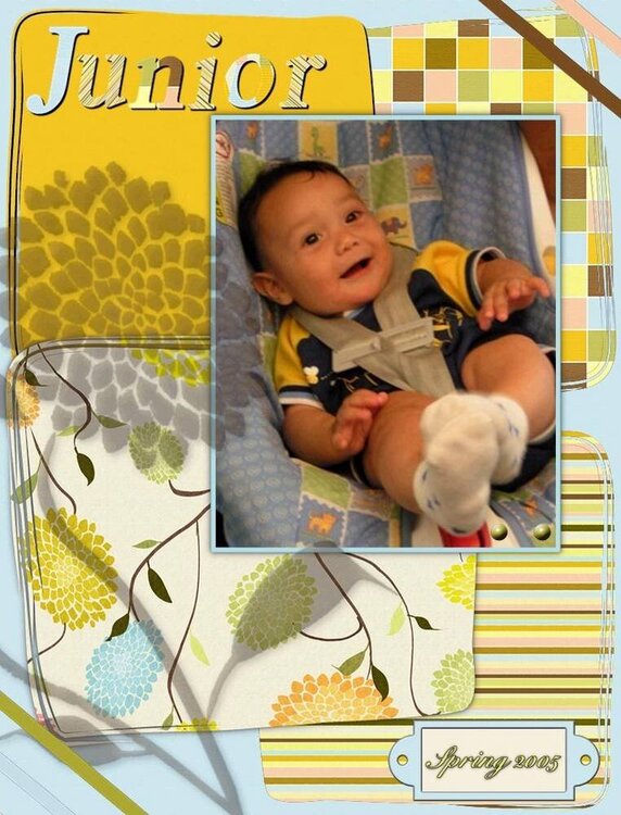
The Fleur kit by Victoria Stegall for oScraps.com
No products have been added to this project.


Thanks for spreading positivity!


April 11, 2006
April 05, 2006
April 05, 2006