Mother's Day Weekend!
Take an extra 9% OFF with code: LOVE
Take an extra 9% OFF with code: LOVE

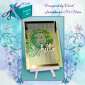
 Give a Cheer
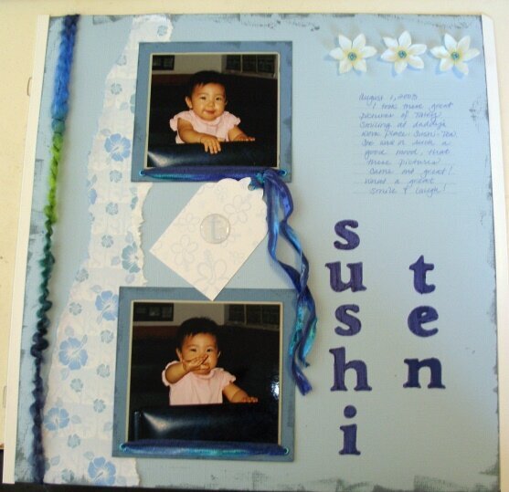
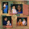
This is the name of my dh's family owned restaurant. While we were there one afternoon, I took some photos of my dd smiling and laughing.
No products have been added to this project.
Thanks for spreading positivity!


February 23, 2005
January 19, 2005
January 15, 2005
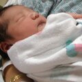
January 14, 2005
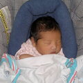
January 13, 2005
January 13, 2005
January 13, 2005
January 13, 2005
January 13, 2005
January 12, 2005