FREE Standard Shipping on Orders $69+ with code:
FREESHIPPING

Cheers
Give a Cheer

 Give a Cheer
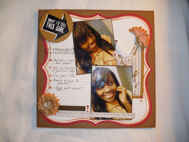
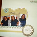
Another LO of DD.photos taken early 2009 by DD
No products have been added to this project.

Thanks for spreading positivity!


November 03, 2010
February 17, 2010
February 13, 2010
February 12, 2010
February 11, 2010
February 10, 2010
February 10, 2010
February 10, 2010
February 10, 2010
February 09, 2010
February 09, 2010
February 09, 2010
February 09, 2010
February 09, 2010
February 09, 2010
February 09, 2010
February 08, 2010
February 08, 2010
February 08, 2010
February 08, 2010
February 08, 2010
February 08, 2010
February 08, 2010
February 08, 2010
February 08, 2010