Livestream Party!
Join us today at 9:00am PT / 12:00pm ET | Details Here.
Join us today at 9:00am PT / 12:00pm ET | Details Here.

 Give a Cheer
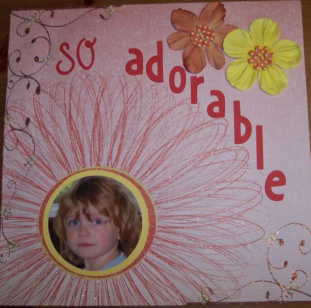
a layout of my neice
No products have been added to this project.


Thanks for spreading positivity!


June 26, 2007
June 21, 2007
June 20, 2007
June 20, 2007
June 20, 2007
June 19, 2007
June 19, 2007
June 19, 2007
June 19, 2007
June 19, 2007