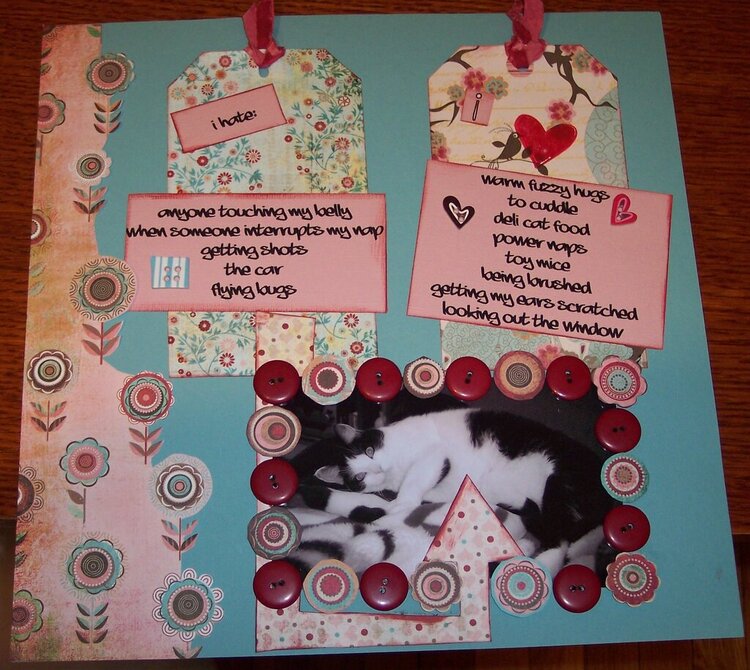
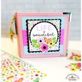
I love your cat, first of all--reminds me of one I had! Beautiful pp to use & your tags...stunning! I think if you have the right journal block angled that you should shift the left journal up & also angle it but the opposite way (not as much as the tag above it though). I even wonder if the arrow should be from the "I like" block instead of the "I hate"...a cattitude "this is what you *should* do for me". This made me laugh though because, absolutely, every cat has their list, don't they!
Great choice in journaling font and tag pps. I like the square and heart buttons, and what you did with the ghost heart. Although the arrow serves to draw attention to the photo, I think the dark color of the buttons overshadows the intent. Instead, I'd try using that torn pp right behind "my" from the left page as your arrow, and use the polka dot pp in place of the dark buttons. I like what the inked edges add to both pages, and would consider inking the edge of the blue cs as well.
I really love that button frame, and how you cut around the flowers in the pp. That arrow definitely brings my attention down to the photo. I think I would maybe put the tags a little closer, and tilt them a tad bit in opposite ways.. and then straighten up the squares with his likes and dislikes. Really cute, I love the colors in this two pager
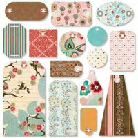
Great LO fitz! The PP is awesome, love the little flowers, the buttons, mixed with the flowers are a unique touch. Great job journaling and I think my favorite thing about your LO is the tags! They are gorgeous. Great job!
Does this project or one of it's images contain pornography, profanity, or other illegal or offensive material? If so, please report it and our moderators will come by and clean it up in a flash.

%20-%20Scrapbook.com)

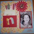
 Give a Cheer


August 25, 2007
August 22, 2007
August 22, 2007
August 22, 2007
August 22, 2007