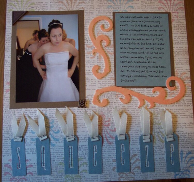
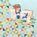
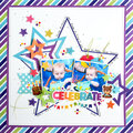
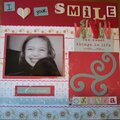
Really like your colors here and the background PP is definately awesome. I do suggest putting some solid colored pp behing the squares with the letters. It's a little hard to seem them as is.
I, too, love the color scheme. I would make put orange paper behind the squares and ink the edges of the blue boxes just to make it pop more. Awesome topic to scrap
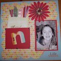
You look great, despite the "squeeze" factor! Very cool that you scrapped this. I am seeing a little more brown to unify things, like adding brown rectangles behind the title letters to make em "pop" more (like Moi said) as well as maybe some brown ink around the whole background edge. I think the color scheme is unique & complements your background pp...if that was your initial choice, I say go with it!
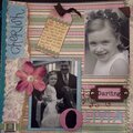
Beautiful LO! The only thing i would maybe do different is ink the edges of the swirly to give it a little more umph. I believe you could also double mat the photo, leave the brown matting as is, and make a thin matt for the photo with a cream paper. AGain LOVE the ribbon, i need to use ribbon more like this!
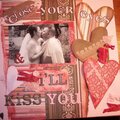
This is beautiful! Love the photo! I think you can do white wash on the orange swirls-they just pop too much and you can use the same white washed orange behind the title letters.
Ah, yes. The Stamped Cricut font. I love that feature, but the letters didn't pop for me either in a previous lo. You can try outlining around each letter and inking the edges of the boxes. As for blue and orange, they are complementary colors, so putting them here like that, is the reason why attention is drawn to them and away from your photo. Very cute pic and subject, btw! I like the photo corners, but neutrals, like brown have a tendency to dull things. White or cream may make good mats, instead.
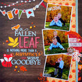
I love those letters and the photograph! The journaling is nice as well as the large swirlies. Were orange and blue in your wedding colors? I am asking because I do not find those colors exactly match. I would have made the swirlies white and maybe added orange to accent them but I find they pop out too much right now as my eyes go straight to them.
I do love your placement of everything, I think just the colors need to match a bit more to give an elegant wedding feel.
OMG, this is a hilarious story packaged in a beautiful LO. HA! First of all, lemme say this is my story every morning when I enter my closet. So, I totally feel your pain, literally and figuratively. Ok, I love the title and the seperation between the letters. Your colors bring out the subtle colors in the newsprint patterned paper and really tie the whole LO together. Love your flourishes, they frame the journaling nicely. My only suggestion would be to ink the outside edges of the title letters to make them pop a bit. Otherwise, wouldn't change a thing! Great job!
Does this project or one of it's images contain pornography, profanity, or other illegal or offensive material? If so, please report it and our moderators will come by and clean it up in a flash.


 Give a Cheer


October 10, 2007
October 10, 2007
June 26, 2007
June 21, 2007
June 20, 2007
June 20, 2007
June 20, 2007
June 19, 2007
June 19, 2007
June 19, 2007
June 19, 2007
June 19, 2007
May 14, 2007