FREE Standard Shipping on Orders $69+ with code:
FREESHIPPING

Cheers
Give a Cheer

 Give a Cheer
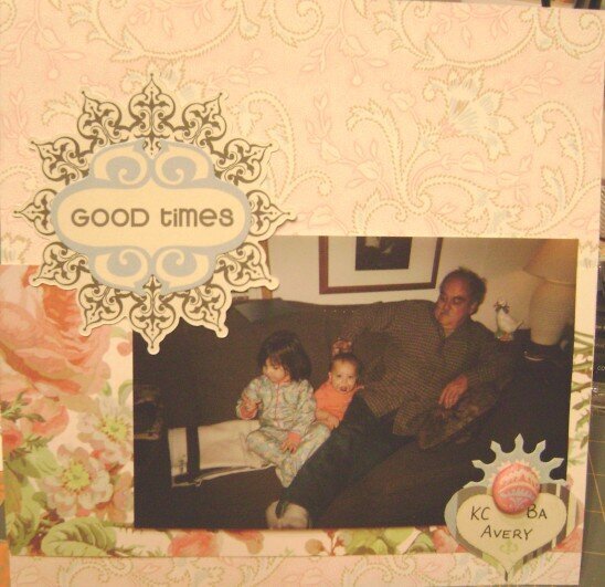
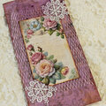
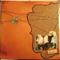
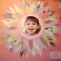
Quick 8X8 I did for my nieces' scrapbook. I don't like the huge brad, but I don't have anything else that would work well there.
No products have been added to this project.
Thanks for spreading positivity!


August 22, 2009
March 26, 2009
March 13, 2009
February 20, 2009
February 19, 2009
February 12, 2009
February 09, 2009
February 06, 2009
January 31, 2009
January 31, 2009
January 30, 2009
January 29, 2009
January 29, 2009