What fun, bright papers! I do agree with Jas that using a different color for the main background would probably work better though so that the bright doesn't overwhelm the photos. I really like how you angled one pic on each page and then left the others straight. In my opinion, your los are a GREAT kind of clutter, because they aren't really cluttered at all. You do use a lot of pics per lo, but they are always arranged in such a way that it feels very organized in design and not just random chaos. That is something that I really really like about your scrapping style. It is true that this particular page doesn't seem to have a single focal point, but maybe you want each pic to have equal weight, so I think it is fine. If you did want to enlarge one as a focal point, I really love the one of her almost biting the cake!
I really like the color choices. I think they help make the layout festive and offset the fact that the photos don't have a lot of fascinating action (a perpetual problem for the very important traditional sitting-around-the-table-in-front-of-the-cake photos). It's a huge problem and the reason I haven't scrapped either of Meg's birthday parties! I have the hardest time saying goodbye to photos I love that just don't make the first cut for my layout. I think your stickers get kind of lost against the bright colors however. I wonder if you would consider enlarging one or two of the photos though and shrinking some of the others to create a focal point. I think that might help make this a little more accessible.
I have a tendency to do multiple photos in each layout. Often, I will use only one if it is stupendous, if that one photo communicates the whole message, or if I have a very limited supply of photos. I favor 2 page layouts because it gives me more space and allows me to tell more of the story, but I can see that nowadays, there is a trend toward single photo layouts, and that some people might think my work is sort of cluttered. I just hope it is a good kind of clutter - the 'cup running over' kind of clutter.
I like the colors that you chose. They're very vibrant and from what you have shared of your granddaughter, they match her personality! I do like your cropping of the balloon in one of the photos. It gives it a bit of a 3-d effect. I'm just wondering because I've seen so many of your layouts as double-page layouts on one event, but do you ever do a layout of just one or two photos, or several layouts of one event? Do you ever do one page layouts?
I love how you always got good journaling in your pages! Totally makes these events memorable! One thing tho', the colors are a little bright such that it overpowers the photos. I would change my background cs to a less powerful color than orange...thinking out loud, I think black would look good here. If the colors still look a bit bright, perhaps you can just tone the rest down a bit by decreasing opacity. HTH!
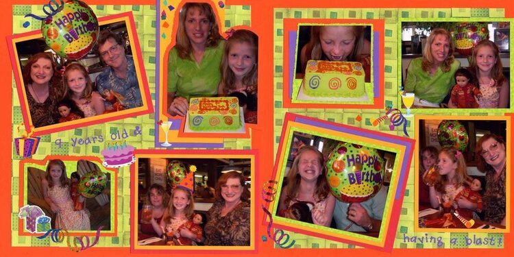
Nine years old and having a blast. *** Leah had her 9th birthday in Williamsburg, Virginia, several hours away from our home. The women in the family planned the vacation, and it was Grandpa Larry's job to plan the birthday party. He did a really good job, by using the internet. He ordered a cake from Baskin Robbins, in just the colors that Leah would want. He got reservations for a great table at Chilli's Restaurant, so Leah could have ribs. He even ordered a big colorful balloon to float over our table. He had everything arranged so that when we walked into the restaurant, everything was ready for us and we were ushered to our table like honored guests. *** After dinner, we went to Pirate's Cove to play some miniature golf. Leah's birthday party lasted about 3 days. *** That girl really knows how to party! ***
Does this project or one of it's images contain pornography, profanity, or other illegal or offensive material? If so, please report it and our moderators will come by and clean it up in a flash.
August 15, 2006
July 30, 2006
July 24, 2006
July 24, 2006
July 21, 2006
July 14, 2006