Shop the Die Cutting Sale!
Take 10% OFF Orders $100 or More! Use Code: SMILE
Take 10% OFF Orders $100 or More! Use Code: SMILE

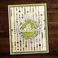
 Give a Cheer
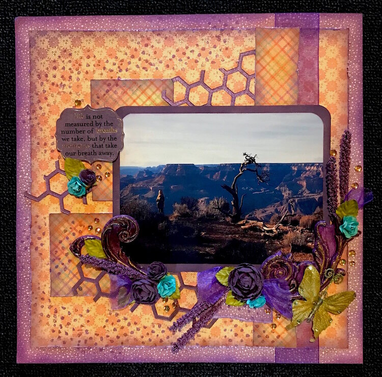
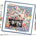
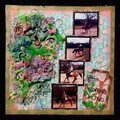
At some point, I'll probably put a "real" title on this, but it hasn't told me yet what its name is.
Dec 11, 2016 on our vacation to the San Diego area. My husband had never seen the Grand Canyon, although it was pretty much a frequent thing for me during my childhood years. We'd stop by every time daddy was relocated from one coast to the other on our way to our new living quarters.
During the time we've been married, I've mentioned this place a couple of times when trying to talk about how big something is, but hubby - having never seen it - didn't have a frame of reference for the idea. Now he does.
Based on our travel timeline, we got there roughly an hour before sunset, which in my opinion is the BEST time to see it - the setting sun just puts such beautiful color on the walls and surrounding landscape.
I gave him a couple of minutes to take it in, then looked at him and said, "Well....?" He looked at me and said, "I'm speechless."
Mission accomplished.
I love this photo that he took - me doing my typical death defying photo shooting with my Nikon and him standing back and watching. I'm not REALLY as close to the edge as I look (oh, ok, I really am, but my feet were really firmly on the ground and I was being tremendously careful). I think it does a great job capturing the size of creation and the insignificance of man by comparison.
~ * ~ * ~ * ~ * ~ * ~
Papers are Graphic 45's Fairie Dust Collection
This is the first time I've played with Paper Clay. The purple flourishes are created with it and a Prima mould. Then painted with some metallic purple paint and top dressed with DecoArt's Metallic Luster Wax in Iced Espresso.
The stem flowers are in Hobby Lobby's floral section for this spring. The journaling sentiment is a clear sticker, placed onto purple paper, then adhered with dimensional dots to give it some lift.
The honeycomb is cut with my BigShot, using Tim Holtz's Honeycomb Die. I used a cereal box to create them, then inked them, gave them a bit of sticky with some spray adhesive, and applied some Pearl Ex Reflex Violet Mica powder to give them some shine.
This is not my most favorite project ... the elements had a hard time coming together on it, but I'm pleased with the way the color palette features the photograph and I'm happy to put it into my vacation album in the done column!
~ * ~ * ~ * ~ * ~ * ~
Challenge Stack ~
1. Travel G ~ Grand Canyon
2. Scraplift the Person Before You. I followed Carol (NMScrapper) and loved her project "Delight" the minute I saw it. I really wanted to try her technique of creating that zipper element with a punch, but my papers didn't have the right front and back combination to make it look right, so that'll be something for me to try later. Here's a link to Carol's project so you can see it. It's really spectacular!
3. Scraplift Your Favorites - Carol's project went into my favorites the minute I saw it. I was happy that I got to follow her in the Scraplift challenge because it gave me a chance to try to recreate something similar. I wasn't as successful as I'd have liked, but I have papers for my April kit that I think will work much better, and I plan to have another go at it!
4. Mixed Media. I think that the paper clay flourishes definitely put this in that category, along with the recycled cereal boxes and PearlEx product.
Thanks for taking a peek. :-)
No products have been added to this project.
Thanks for spreading positivity!


September 03, 2018
September 03, 2018
April 20, 2018
April 20, 2018
April 20, 2018
April 20, 2018
March 26, 2018
March 26, 2018
March 26, 2018
March 26, 2018
March 26, 2018
March 26, 2018
March 25, 2018
March 25, 2018
March 24, 2018
March 22, 2018
March 22, 2018
March 22, 2018
March 21, 2018
March 21, 2018
March 19, 2018
March 19, 2018
March 19, 2018
March 19, 2018
March 19, 2018
March 19, 2018
March 18, 2018
March 18, 2018
March 18, 2018
March 18, 2018
March 18, 2018
March 18, 2018
March 18, 2018
March 18, 2018
March 18, 2018
March 18, 2018
March 18, 2018
March 18, 2018
March 18, 2018
March 17, 2018
March 17, 2018
March 17, 2018
March 17, 2018
March 17, 2018
March 17, 2018
March 17, 2018
March 17, 2018
March 17, 2018
March 17, 2018
March 17, 2018
March 17, 2018
March 17, 2018
March 17, 2018
March 17, 2018
March 17, 2018
March 17, 2018
March 17, 2018
March 17, 2018
March 17, 2018