
Happy National Scrapbook Day!
Extra 10% OFF Select Scrapbooking Brands with Code: NSD24
Extra 10% OFF Select Scrapbooking Brands with Code: NSD24

 Give a Cheer
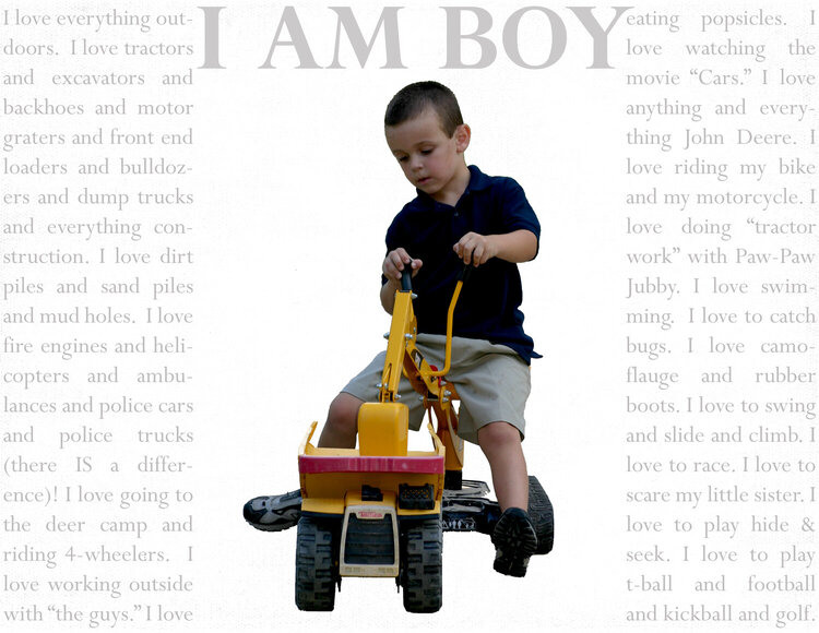
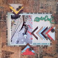
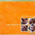
just some journaling about what my ds likes at age 5; completely inspired by BC mommy's LO with same title...
is this one better (w/out) repetition of title?
No products have been added to this project.
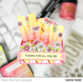
Thanks for spreading positivity!

%20-%20Scrapbook.com)


December 29, 2007
December 09, 2007
November 22, 2007
November 21, 2007
November 20, 2007
November 20, 2007
November 20, 2007