
Happy National Scrapbook Day!
Extra 10% OFF Select Scrapbooking Brands with Code: NSD24
Extra 10% OFF Select Scrapbooking Brands with Code: NSD24

 Give a Cheer
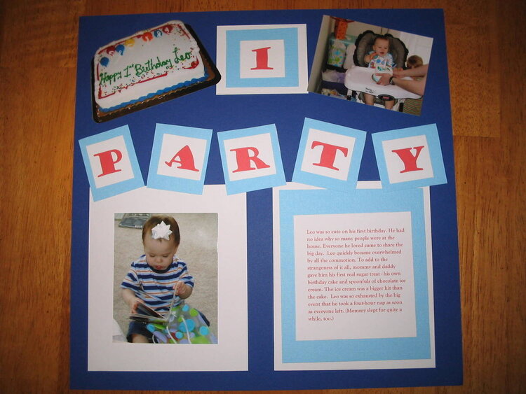
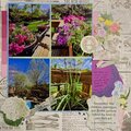
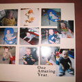
This layout was inspired by a sketch from scrapinsuzoo (Layout #3).
No products have been added to this project.

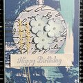
Thanks for spreading positivity!


January 01, 2006
October 01, 2005
September 27, 2005
August 15, 2005
August 05, 2005
August 02, 2005
July 27, 2005
July 27, 2005
July 24, 2005
July 24, 2005
July 23, 2005
July 22, 2005
July 22, 2005
July 03, 2005