I love this pp and this happy grandpa pic. I agree about the fish pic, I was trying to figure out what it was 'cause I was thinking about ice cream LOL. I agree with the suggestions about having this pic on another Lo. I'd use the F (it's an ice cream) from SUGAR COMA (free font)to the I of Ice cream. For the rest of the title try APPLE JUICED (free font). I believe you could use the blue paper of the tag to the title and add this paper in the left hand side also on curve lines and some drops as ice cream melting. Did I make sense? I love the rafia
great pic of grandpa! :) hence, i suggest that an enlarged photo of him be the focal point. the "fish" pic at the bottom is quite confusing. since you said "grandpa's ice cream" i thought, with the fish pic at the bottom, his ice cream was "fish" flavored or was made with fish or something related to the fish, at least. (aweful, huh! :d ) so i suggest you completely omit that pic (or use it on another page). ;) as for the fonts, you could use bold fonts like cosmopolitan perhaps(?), for "Grandpa's Ice Cream" and for the "Dole Plantation, Wahiawa"... use another font and maybe 2 to 3 points smaller than the title (print on cream colored cs and double mat w/ a darker complementing color--- mustard or lime would be great too). :) i'm sure that whatever you finally come up with would be great! ;)
This is very pretty! Love the pps you used! I really like the suggestions of making the pic of your grandpa the sole focus, and putting the title (in two different fonts) on a yellow cardstock, then covering the curent tittle up with the pineapple or icecream idea. I like the rafiia too, but if you don't like the color, you could paint like Leanne suggested or ink it (mustard color ink would be great). Love the littel brads you used too; can't wait to see the final porduct :)
Hi Heather. I would have to agree with Tracey about the fish pic. I was trying to figure out the connection between fish and ice cream. (What a terrible flavor! :) ) I really like the font you used for the title. I'm having difficulty coming up with ideas to make it pop more... Ok. I think I would remove the fish photo from it's mat and replace it with the pic of your Grandpa. Then I would write Dole Plantation on the top of the mat between the two brads, and Wahiawa on the bottom of the mat between the other two. (In the same font.) If you can't cover up the title maybe you could find paper with pineapples on it? Also, this is just an idea, but can you paint raffia? You could try that and maybe change the blue mat to green if you aren't happy with it. As for the extra space you would end up with where Grandpa used to be... Ummm... maybe you could find online, or take a pic at a store of a group of pinapples or buy a box of ice cream cones and put them in a messy pile and take a pic of that? Or you could use that mat to put the title on. If you wanted to keep the same background paper you could cut out a rectangle from behind one of the mats and use it to cover up the original title. Well, I'm probably making you more confused. :) You do beautiful work, and I'm positive that whatever you decide on will be great!!! TFS!
Hi Heather ~ OK, I'll give it a whirl. If this were my LO, I would enlarge grandpa's photo and crop out some of the background. I do not see a photo of your sis, rather, I see fish. I'm sure they are from Dole Plantation, but IMO the photos do not work well together. You could use that photo on another LO and expose the journaling since it tells such a nice story. I really like the font for the title! I think it fits very well with "grandpa!" Just my .02 cents for whatever it's worth! TFS your fine work with us! ;-)
Nice lo! I like the title, but I see what you mean about it not popping out as much from the pp. Maybe you could print it on white or orange? Hmmm...I don't know. I'll keep thinking on that. The page looks great though! I like the bright colors and the rafia.
i think the same color of blue (the one you used in the tag would work here). I can't think of a font right now, but it would be great to use one font for the Grandpa's ice cream and another font for the Dole plantation. Also, perhaps you can put an off-white bloom on the left side (of the title). HTH!
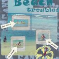
Urmmm... my title needs HELP! I like the words, and I hate the font. Since I was doltish enough to print it on the paper, I could use some advice on what color paper to print it on as well. (To cover up the old one) That blue - nothing but black shows up on it. And I wouldn't be able to get white rub-ons for a couple of weeks, so I'd love to hear other suggestions?
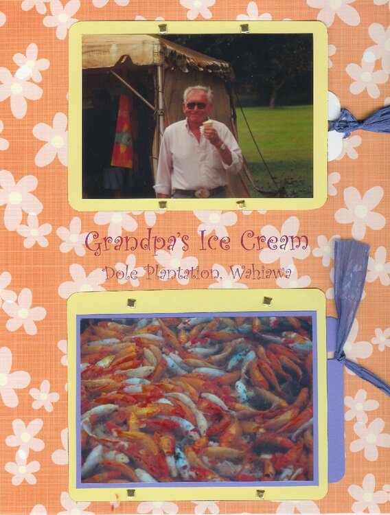
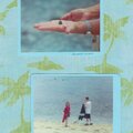
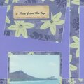
The journaling on the upper tag says: Dole Plantation. I don't even remember how many times we wound up visiting there. All for the sake of the pineapple ice cream! Grandpa had it in floats, and in pineapple boats! And then he had a sundae and a cone. I don't know that I've ever seen such complete happiness and enjoyment on a grownup person's face before. For years afterwards I kept checking with Dole to see if they sold it anywhere on the Mainland, or if there was any way to get more to Grandpa.
The bottom tag is an 'ok' photo of my sister, with room for my Mom to journal on the back.
Does this project or one of it's images contain pornography, profanity, or other illegal or offensive material? If so, please report it and our moderators will come by and clean it up in a flash.
October 03, 2005
September 28, 2005
September 28, 2005
September 28, 2005
September 28, 2005
September 28, 2005
September 28, 2005
September 28, 2005
September 28, 2005