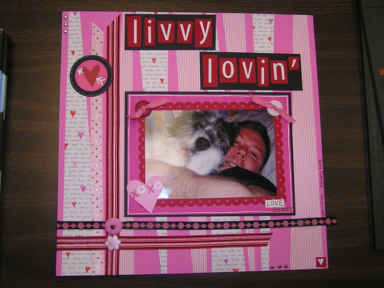
WOW! I love the use of those colors on this page. I would have never tried the reds and pinks on a page with a male subject, even though the dog is a girl. You did an awesome job, I like it!!!
SHCG: Great job coordinating all the ribbons and pp strips. I really dig how the strips are cut into those shapes, and what the groups of three brads add to the page. I like the ribbon going through the buttons, and the scalloped, hole punched frame. Cute pic, of course. I'd remove the red button, move the tiny heart at the bottom right corner to the spot right next to love, maybe even set askew so it doesn't blend into the corner of the frame, and I'd write the names and date under the black ribbon, going across the striped pp. I love the way the title jumps out against the red and black. Nice work.
SHCG: This is so cute! I love the mutliple pps, the arrangement of the ribbon, and of course, the cute picture! I think I might take away the heart on the lower left of the picture and the button on the top right; to me, maving all 4 items seems a little bit much. Great LO!
SHCG: Janet, I love the way this layout comes across as a Valentine layout. Perfect for the picture of Olivia and your hubby. The title rocks and describes the photo perfectly! I am soooo digging the strips of paper and the ribbons. What I like most about them is the way that the tapered ends draw my eyes up, down, and across the layout. Super job creating continuity. I love the way the black creates such a contrast with the hues of pink. This is fantastic.
SHCG: Awwww, this is so cute! That picture is adorable, I love how you did the frame around the pic also. I really like how you did the strips of papers and ribbons, the colors and the title is so cute! Great job :)
SHCG - What a feast for the eyes this is, Janet! Terrifically cute photo & title. I utterly dig that background of pp & ribbon. Marvelous playful colors & embellies...there's just so many cool things to look at, from the tiny corner embellies, to the cool patterns on everything...love it all! Outstanding scrapping!!
SHCG: I totally love how you created the background for this page with the different pps. I think the black title boxes are a bit too start a contrast on this LO in that large a quantity of the color. I'd suggest trimming them more around the title to act as a mat, but that's just my personal preference. Great embellishment use.
Does this project or one of it's images contain pornography, profanity, or other illegal or offensive material? If so, please report it and our moderators will come by and clean it up in a flash.


 Give a Cheer


November 30, 2008
November 30, 2008
November 29, 2008
August 18, 2008
August 11, 2008
August 09, 2008
August 08, 2008
August 02, 2008
July 28, 2008
July 28, 2008
July 28, 2008
July 28, 2008
July 28, 2008
July 27, 2008
July 27, 2008
July 26, 2008
July 26, 2008
July 25, 2008
July 25, 2008
July 25, 2008
July 25, 2008
July 25, 2008
July 25, 2008
July 25, 2008
July 25, 2008
July 25, 2008
July 25, 2008
July 25, 2008
July 25, 2008
July 25, 2008
July 25, 2008
July 25, 2008
July 25, 2008
July 25, 2008
July 25, 2008
July 24, 2008
July 24, 2008
July 24, 2008
July 24, 2008
July 24, 2008
July 24, 2008