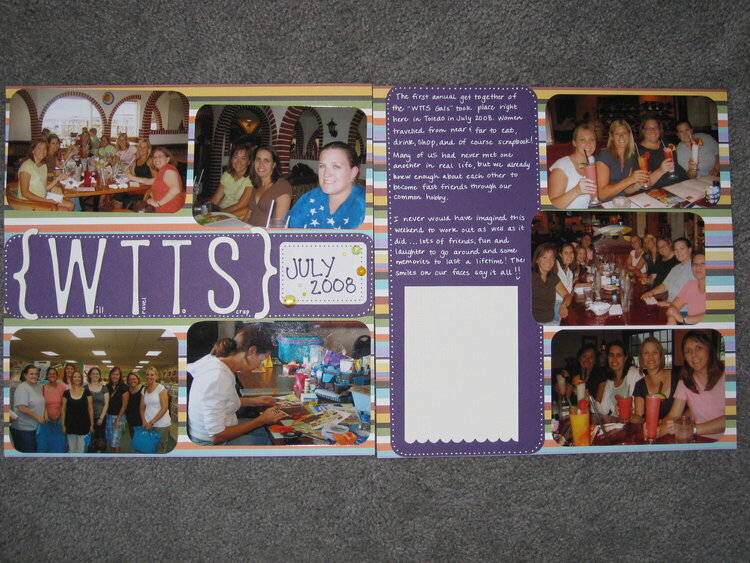
SHCG: I really like how you made the title! The only thing I would change would be adding very thin white mats to each pic just to lift them off the pp a little. BTW- you have great handwriting for journaling!
SHCG: Cool too page spread. LUV the horizontal paper (I may even have the same paper). The white dots are fun and the rounded corner photos are perfect. My only feedback would be the scalloped edge to the white. It's a little stark. If something else was also scalloped like maybe the square with July 2008 it might not stand out so much. PS and those are some mighty fine looking drinks!
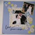
SHCG: Gorgeous 2 pager. I love the white pen and how you used it! Your handwriting is beautiful and makes the LO so personal. The Title is awesome! The pictures not being in perfect lines is awesome, it made me look at each photo. Great job!
SHCG - Janet, I love this spread! Awesome colors & pp. The white doodling & the round corners look excellent. Your handwriting is beautiful. Fabulous job!
SHCG: This is a great 2-pager Janet. Love the colors and the design, the doodling is cute around the journaling. Cool to have that spot for people to sign. :)
shcg: Wonderful lo! Your handwriting is beautiful. I love how you did your title and the date block. I'm trying to figure out if you wanted the top left picture to be crooked or not...if you didn't, it is...if you did, I think I'd straighten it out since everything else is much more linear. Great job!
SHCG: I think this lo is awesome the way it is! Love the rain dots and the rounded corners on the photos! The title and journaling on the purple with the white dots-great!
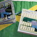
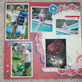
SHCG: I love that you chose fun, festive colors for what looks like was a fun festive event. I also like that you went with an acronym and then wrote in small type what each letter stands for. All the white doodling and lettering gives a nice pop to all the color. The rounded corners are also a nice accompaniment to all the straight lines of the pp. I'm wondering if you're going to number the photos to correspond with the list of the names that you'll place in the white box, or if you even need to. Are those more of those rain dots in the date box? Love how you used those here. I can totally see a dimensional tall drink with a straw sticker on the bottom left of that white box with the straw going up the right edge. That's just me. Loves me some cocktails. Drinking and scrapping! Great mix!
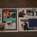
SHCG: I really like this lo. I had already commented below before yo opened it up for SHCG. The only thing I might change would be to mat the pics to make them stand out a bit more.
Does this project or one of it's images contain pornography, profanity, or other illegal or offensive material? If so, please report it and our moderators will come by and clean it up in a flash.


 Give a Cheer


September 21, 2009
September 16, 2009
September 12, 2009
September 10, 2009
September 10, 2009
September 06, 2009
September 04, 2009
September 03, 2009
September 03, 2009
September 03, 2009
September 03, 2009
September 02, 2009
September 02, 2009
September 02, 2009
September 02, 2009
September 02, 2009
September 01, 2009
September 01, 2009
September 01, 2009
September 01, 2009
September 01, 2009
September 01, 2009
September 01, 2009
September 01, 2009
September 01, 2009
September 01, 2009
September 01, 2009
September 01, 2009
September 01, 2009
September 01, 2009
September 01, 2009
September 01, 2009
September 01, 2009
September 01, 2009
September 01, 2009
September 01, 2009
September 01, 2009
September 01, 2009
September 01, 2009