SHCG: I enjoyed looking at this, the simplicity of it makes it so awesome. I don't have an issue with the colors at all. The photo corners are a great idea and tie in with the smaller ribbon and colors in the photos.
SHCG: I really like this... you did a great job by using very little! I do like the idea of a small metal embellie on the ribbons, but otherwise I think it's just super!
SHCG: Great job on using pink and yet making a masculine looking page. Not an easy task, but one you accomplished quite well. I really like the plaid ribbon on this page, but am thinking some little charm or embellishment might work well right where the ribbon intersect. Also, an image just came to my mind of some white sharpie doodles on this page. Because of the all black background I think they would really stand out. The pictures however say it all on this page and you did a wonderful job capturing the occasion.
SHCG: Love the title , love the way you inked the photos, love the photo placement, the journaling is great, the corners on the journaling block are awesome, so are the ribbons! Well, is it safe to say that I love it all??? Great lo!
shcg: love how you used pink on a page about your bro! very cool. great minimalistic effect accomplished across the two pages. less is more, yeppers. your talk of food makes me hungry in the journaling, as always. i agree with the others who mention using something at the intersection of the ribbons, whether a diecut, chipboard, brad, what-have-you, it will tie the two pieces together a bit more cohesively, i think. beautiful job on this 2-pger!
SHCG: I really like your placement of everything, how you inked the photos and how you used pink on this layout and it works. Maybe you can find a little graduation cap embellie to put on where the two stripes intersect. Great job :)
SHCG: I like the ribbon placement, the photo inking, and the photo corners made from pp squares. I can see why you used that title font again. It totally suits your subject. I'd like to see it shadowed in white to keep with your color scheme, which I like, too, but I can see a golden yellow instead of pink. I can also see some hardware, like a brad where the ribbons intersect. I definitely like the simplicity of this and have been doing a lot of thinking about keeping my pages this simple for the sake of getting more los done.
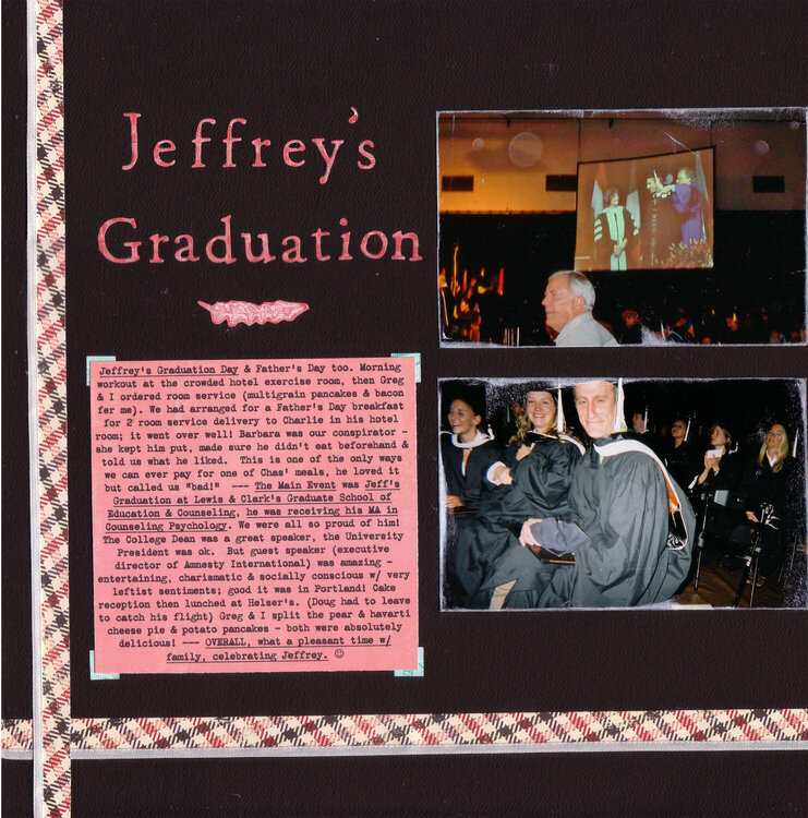
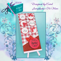
Please excuse the imperfect scanning/stitching here, there's more of a right margin that got cropped off. This is my BIL's '06 grad school grad in Portland OR (DH & I went there then tagged on a few days in San Fran on our own).
I kept things pretty streamlined here given the masculine subject but I still wanted a little “upbeatedness” since it was summer & we were all having fun together. The borders are pp & white ribbon. The "photo corners" are pp squares. The date is on a pp-covered chipboard shape. Top pic is a shot of BIL on the projector. (I think I might've used the same Quickutz font for my DH's grad school grad page…yes I did, heh, it just says “grad!” to me without taking up too much space, LOL…)
Does this project or one of it's images contain pornography, profanity, or other illegal or offensive material? If so, please report it and our moderators will come by and clean it up in a flash.
January 10, 2010
November 08, 2009
November 06, 2009
November 03, 2009
October 24, 2009
October 21, 2009
October 21, 2009
October 21, 2009
October 19, 2009
October 18, 2009
October 18, 2009
October 18, 2009