SHCG: This is a very interesting layout with the almost window like look in the center, the colums on photos on the left and right, and then the punch of excitement with the circle photos & journaling. You would think it would be too much but it isn't. The eye travels around and around. Great touch on the thread detail on the journaling.
SHCG: Sharon, this page is so creative and visually interesting. I also love the fact that you made a summary page of your trip. --A page that you will be able to look at and remember those wonderful moments on this vacation! The circle photos and circle journaling are also super cool! In addition, your pictures show that this is a beautiful place! I do not really have any suggestions here, I think it is great just the way it is.
SHCG: What a great 2-pager! I love the photos and how many of them you managed to fit here! I love the circles-photos, journaling, brads, pp! Also, great way to use the floss! I would suggest you use one more blue circle- bottom right, so the visual triangle is completed! I love, love the way your title turned out-great choice to go with while and great dimension! Looks like one awesome trip!
SHCG: Awesome job Sharon. I love the lettering on the photos, trial and error, and the end result is perfect. I love the journaling bubbles and the couple of "bubble" pictures. The colors are awesome. Love the 3 brad bit on the top mid left and the bottom mid right...great way to keep it all flowing.
SHCG: Great two pager! I love the journaling circles and the stitching! The combination of the photos and the colors you chose are so peaceful and relaxing!!
SHCG: This is such a serene spread. I love the combo of straight lines (both horizontal and vertical) and circles. I also like the mix of textures. Love those brads and stitching, too. Following the circle form is a very cool way to add variety to journaling, btw. I love that green textured solid so much as a Philippine motif that I really want to see a tad bit more of it as a thin mat to the outer margins of the journaling circles. I notice that when I do spreads I tend to mirror my pages, so I'm trying to move away from that, but I really like the way it works here. Really nice dimension to the title and nice job on tying the two pages together by spreading the title across the spread. I'm glad you went with white. Great job on the challenge. I would have such a hard time doing a summary vacation lo, no matter how feasible you've made it look.
SHCG: This is awesome Sharon! I just love the design, especially how you echoed the circles in pictures/journaling to match the background paper. I also love the stiching around the journaling circles and the title right on the photos :) great response to the challenge!!! :)
SHCG: I feel like I'm watching a commercial for travel to the Philippines. I love 2 page spreads lately (I suppose that has been obvious). This one is great. The only suggestion I have is adding a bit more texture. I like what you started in the middle part with that nice green pp, but I feel a need for a bit of texture on the far left and far right. I am not quite sure what you could add that wouldn't take away from the fun circle pp there. I like that the symmetry works here too. I'm not always a fan, but it is perfect here.
edit: okay, I skipped over the one important sentence in your description. Sounds like you took care of the texture balance already. :-)
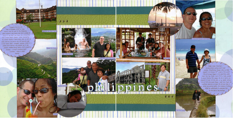
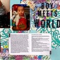
This LO summarizes our '07 trip to the Philippines & is also my response to MaRLeNeF/Marlene's challenge for Scrap Happenzz Critique Group, "Put Some Letters On That Photo" (the challenge called for a LO 8x8 or smaller, I obviously didn't go that route, this is a 12x12 2-pager!). This is a variation of Sketches by Suzy's sketch #70 (doing the right page sketch for each side here) - I love Sketches by Suzy.
Interesting journey making the letters on the photo to answer the challenge. I originally did the letters in the same blue as the journaling rounds. They ended up blending into the green parts of the right side photos too much so I Stickled them for emphasis. They still didn't show well on those green parts so I finally did the white letters w/ a dark teal shadow, because there are both light & dark parts of the photo backgrounds that the letters had to stand out on. Because the already-double layered shadow letters were put on top of the Stickled letters, I got some nice dimension to the title. I love it when stuff happens accidentally that works for ya!
Pardon the scans/sketches; as usual, the edges are chopped off. The journaling ovals are whole IRL plus there are thin left & right borders of the medium green textured cs.
Journaling for those interested: "Enjoyed a trip of a lifetime in November 2007 w/ Greg, Mom & Dad. We went to The Philippines, where everyone in my family was born excluding me (Greg's & my first time there). So AMAZING! Saw various places: Manila – urban, fascinating – my parents hosted a family dinner where we met so many relatives, our hearts were full (separate page exists about that!). Corregidor –gorgeous island w/ a solemn WWII history, very poignant due to my parents' childhood during Japan's WWII occupation. Boracay – a lovely & wondrous beach existence – lazing & island hopping…. Hidden Valley (Alaminos) - relaxing natural spring pools & lush greenery… Mountainous Banaue where we hiked majestic rice terraces (“8th wonder of the world”). Hilly picturesque Baguio, & the beautifully comfy Camp John Hay Manor; loved CJHM's foods, grounds & scenic History Hike. Isdaan, the fun & festive restaurant in Tarlac. All the while, w/ our helpful, informative & FUN driver/guide Romeo. I shall never forget the countless memories we made, the delicious foods & drinks, eye-opening sights, the kindness of others. What an unbelievable & awesome trip to the land of my heritage."
Along w/ Sketches by Suzy, I am really liking vacation summary LOs - it's challenging at 1st to condense an amazing trip into only 2 pages, but once you get into the groove it's a lot of fun (& time-saving too). Thanks again to cindy312 for inspiring me get into them! (Plus you can always do MORE vacation LOs in addition to the summary ones...)
Does this project or one of it's images contain pornography, profanity, or other illegal or offensive material? If so, please report it and our moderators will come by and clean it up in a flash.
June 11, 2010
June 05, 2010
May 26, 2010
May 24, 2010
May 23, 2010
May 23, 2010
May 23, 2010
May 22, 2010
May 21, 2010
May 20, 2010
May 20, 2010
May 20, 2010
May 20, 2010