

FREE Standard Shipping on Orders $69+ with code:
FREESHIPPING


 Give a Cheer
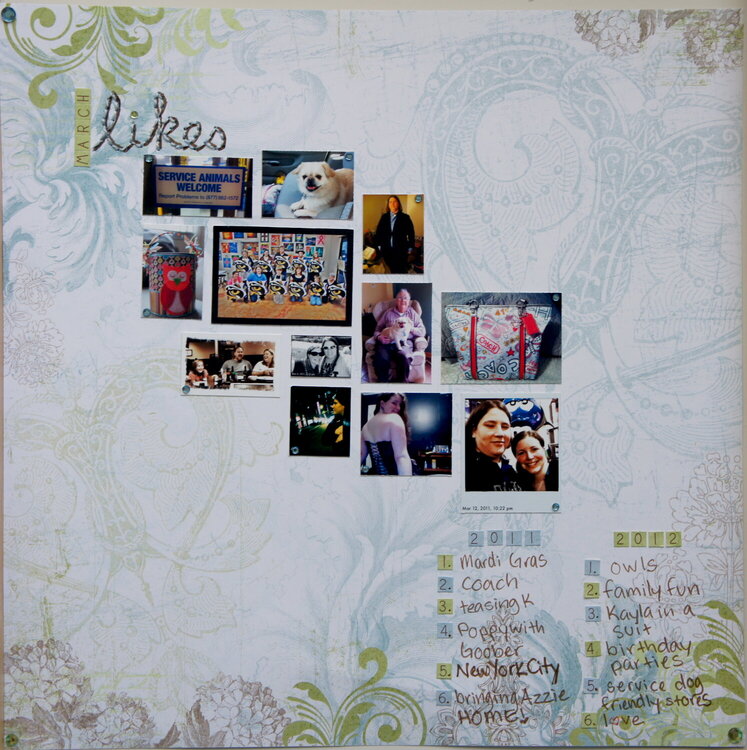
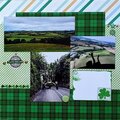
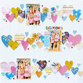
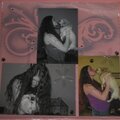
For some AGC daily challenges and the 3rd weekly challenge, as well as the One Month At A Time Challenge. These are all pictures from the month of March 2011 & March 2012. I dunno how I feel about the way this LO turned out. I like the arrangement of the pictures, but I think it might have been better if they were not in color, maybe sepia? I stitches "likes" in the title with blue floss & it is impossible to see against the background. I think a little more planning could have vastly improved this LO, but it is done, so I am ok with it! Each LO is a learning process...

Thanks for spreading positivity!


May 04, 2012
March 27, 2012
March 25, 2012
March 22, 2012
March 19, 2012
March 19, 2012
March 16, 2012
March 15, 2012
March 15, 2012
March 14, 2012
March 14, 2012