Mother's Day Weekend!
Take an extra 9% OFF with code: LOVE
Take an extra 9% OFF with code: LOVE


Be the first to cheer this project!

 Give a Cheer
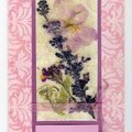
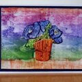
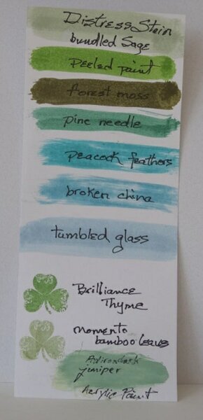
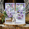
I had fun watercoloring and blending this background with TH ink stains. I used the new Hero Arts stamp set called “Cherish” which has negative image stamps. I blended bundled sage, peacock feathers and peel paint stains for the background. The image and sentiment were stamped with archival inks. Pearls were added as embellishments. When I initially looked at the moodboard the colors appear to focus mostly on bright green. Since then changes occurred and now they are more blue. I have a couple cards I started immediately with a green emphasis. This is one.Photo #2 As Glitter Girl shared in her January inspirational video she started by pulling together products that might work with the moodboard inspiration. I did that and made a fast color swatch tag to assist with my color selections. In GG's inspirational video this month she shared examples of layering to add interest to one's work. For my card I used several colors for the background watercolor, layers of paper and dimension with the pearls.
No products have been added to this project.


Thanks for spreading positivity!