Mother's Day Weekend!
Take an extra 9% OFF with code: LOVE
Take an extra 9% OFF with code: LOVE


Be the first to cheer this project!

 Give a Cheer
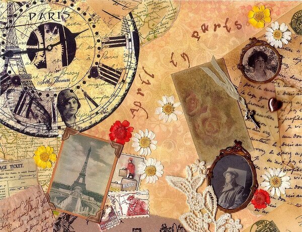
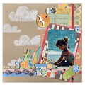
Well…I took some advice from Kathleen, and several others, and tried to come up with a better collage for “April in Paris”. The first picture is the original. If you look close, you can see “competing” shapes, and not enough difference in heights, to catch the eye (among other things). Well…picture two shows how I tried to fix some of those issues. I'm not sure I got what I wanted. So, I attempted the third picture. Added some new things….took off a couple of old…..and this is what I ended up with. I think it has a better focal point…I know the first thing I see is the eyes on the young woman, and then what she is looking at…which are all the items from her “April in Paris”. So….which do you like…and why.
No products have been added to this project.

Thanks for spreading positivity!