I agree about the title and "Y". It's a matter of having a focal point---everything in this layout has equal weight. I'd probably center the main photo,(a mat to match those tights would make the photo pop even more, and I think that paisly paper could hold up to that) make a big Y and title across top and then line up the 2 photos and journaling at bottom, centering the rectangle photo under the main photo.
Grandma Sam
CHT: I agree with Pink about the title. Right now, the Y looks kind of random -- it's not obvious that "Y is for Yoda." I love the PP, too, and I like how you matted the upper-left photo a little off-center.
CHT: The journaling is so cute and it is hard to find something to match the Y. I would suggest making the "y" and the "Yoda" more prominent on the page. They both get lost in the other elements. I would suggest straightening the photo in the middle to please the eye and moving the Y up to the top with the Yoda title. You could move the three circles to the bottom of the large circle they're associated with now. What pp did you choose? I love that design. Great work!
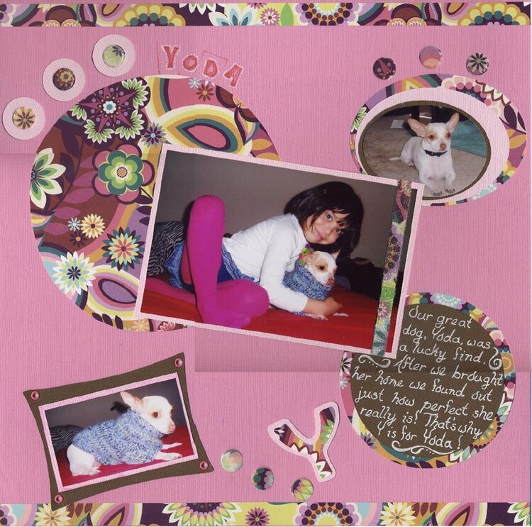
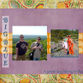
Pictures of our fabulous pooch, Yoda, and my dd, Desi. Journaling reads: Our great dog, Yoda, was a lucky find. After we brought her home we found out just how perfect she really is! That's why Y is for Yoda!
Does this project or one of it's images contain pornography, profanity, or other illegal or offensive material? If so, please report it and our moderators will come by and clean it up in a flash.
October 06, 2006
October 05, 2006
October 04, 2006
October 04, 2006