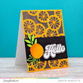
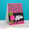
Love the colors. I agree with the rest. I would group the pix closer and put it in the middle. SO that the white space will be outside of the pix not in the middle. In this way, the eye will be drawn and focus on the photos..instead of the white space. Doest that make sense?? kekekekeke..
Great colors Christy! The photos are so engaging! I'd have to agree that by grouping them and putting the "white space" on the outside of the group, the eye would be drawn in. Love your title!
Christy, maybe cut some pp slightly bigger then your pics in a colors that would compliment your blue. You know back the pic's and then you will use up some of the space and draw peoples eyes to the pics. Just a thought.
I love the BLUE!!! Here are some suggestions...if you want to have some white/empty space on the LO, how about moving your pics closer together so that the empty space is around them? Instead of having the names on the strips of paper, how about a journaling block telling about the pictures and the occasion behind them? Since this is part of a two-page spread, I would run my title over both pages to link them together better. JMHO...great start!
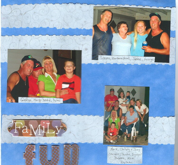
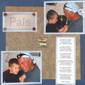
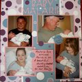
***Revised*** I rearranged a few things and have to agree that it is better. When I scan the pics I have to do it in 2 scans and "paste" together, for some reason it doesn't put things together as straight as they really are.
This was summer 2004 and a get together of my DH's lovely nutty family. As you can probably tell, I like 2 page LO's
Does this project or one of it's images contain pornography, profanity, or other illegal or offensive material? If so, please report it and our moderators will come by and clean it up in a flash.
November 12, 2006
November 11, 2006
November 10, 2006
November 09, 2006
October 30, 2006
October 29, 2006
October 29, 2006
October 28, 2006
October 28, 2006
October 28, 2006