FREE Standard Shipping on Orders $69+ with code:
FREESHIPPING

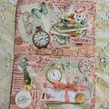
Cheers
Give a Cheer

 Give a Cheer
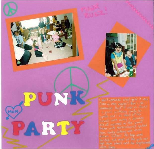
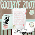
These photos are from about 1991. I know this page sucks. Any suggestions?
No products have been added to this project.

Thanks for spreading positivity!


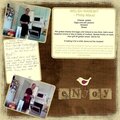


February 14, 2007